Using Fonts
Godot consente di impostare font specifici per diversi nodi dell'interfaccia utente.
There are three different places where you can setup font usage. The first is the theme editor. Choose the node you want to set the font for and select the font tab. The second is in the inspector for control nodes under Theme Overrides > Fonts. Lastly, in the inspector settings for themes under Default Font.
If no font override is specified anywhere, Open Sans SemiBold is used as the default project font.
Nota
Since Godot 4.0, font sizes are no longer defined in the font itself but are instead defined in the node that uses the font. This is done in the Theme Overrides > Font Sizes section of the inspector.
This allows changing the font size without having to duplicate the font resource for every different font size.
There are 2 kinds of font files: dynamic (TTF/OTF/WOFF/WOFF2 formats) and
bitmap (BMFont .fnt format or monospaced image). Dynamic fonts are the
most commonly used option, as they can be resized and still look crisp at higher
sizes. Thanks to their vector-based nature, they can also contain a lot more
glyphs while keeping a reasonable file size compared to bitmap fonts. Dynamic
fonts also support some advanced features that bitmap fonts cannot support, such
as ligatures (several characters transforming into a single different design).
Suggerimento
È possibile trovare file di font con licenza libera su siti web come Google Fonts e Font Library.
I font sono coperti da copyright. Controlla attentamente la licenza di un font prima di utilizzarlo, poiché non tutti i font consentono l'uso commerciale senza l'acquisto di una licenza.
Vedi anche
È possibile osservare il funzionamento dei font in azione attraverso il progetto demo BiDI and Font Features.
Font dinamici
Godot supporta i seguenti formati di font dinamici:
TrueType Font or Collection (
.ttf,.ttc)OpenType Font or Collection (
.otf,.otc)Web Open Font Format 1 (
.woff)Web Open Font Format 2 (
.woff2, since Godot 3.5)
Sebbene .woff e soprattutto .woff2 tendano a generare file di dimensioni più piccole, non esiste un formato di font universalmente "migliore". In gran parte delle situazioni, si consiglia di utilizzare il formato di font fornito sul sito web dello sviluppatore del font.
Font bitmap
Godot supporta il formato di font bitmap BMFont (.fnt). È un formato creato dal programma BMFont. Esistono anche molti programmi compatibili con BMFont, come BMGlyph o il programma sul web fontcutter.
In alternativa, è possibile importare qualsiasi immagine da utilizzare come font bitmap. Questa opzione è supportata solo per i font a spaziatura fissa (font in cui ogni carattere ha la stessa larghezza). Per fare ciò, selezionare l'immagine nel pannello FileSystem, andare al pannello Importazione, modificare il tipo di importazione in Font Data (Monospace Image Font) e cliccare su Reimporta:
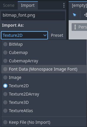
Cambio del tipo di importazione in Font Data (Monospace Image Font)
La disposizione dell'insieme di caratteri del font si può impostare in qualsiasi ordine, ma si consiglia di usare l'ordinamento Unicode standard, poiché richiede una configurazione molto più semplice da importare. Ad esempio, il font bitmap qui sotto contiene caratteri ASCII e segue l'ordinamento ASCII standard:
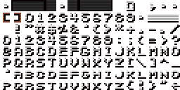
Credit: LibreQuake (scaled and cropped to exclude extended range)

The following import options can be used to import the above font image successfully:
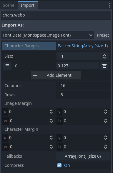
Import options to use for the above example font
The Character Ranges option is an array that maps each position on the image
(in tile coordinates, not pixels). The font atlas is traversed from left to
right and top to bottom. Characters can be specified with decimal numbers
(127), hexadecimal numbers (0x007f) or between single quotes
('~'). Ranges can be specified with a hyphen between characters.
For instance, 0-127 (or 0x0000-0x007f) denotes the full ASCII range.
As another example, ' '-'~' is equivalent to 32-127 and denotes the range
of printable (visible) ASCII characters.
Make sure the Character Ranges option doesn't exceed the number of Columns × Rows defined. Otherwise, the font will fail to import.
If your font image contains margins not used for font glyphs (such as attribution information), try adjusting Image Margin. This is a margin applied only once around the whole image.
If your font image contains guides (in the form of lines between glyphs) or if spacing between characters appears incorrect, try adjusting Character Margin. This margin is applied for every imported glyph.
Loading a font file
To load a font file (dynamic or bitmap), use the resource dropdown's Quick Load or Load option next to a font property, then navigate to the font file in question:
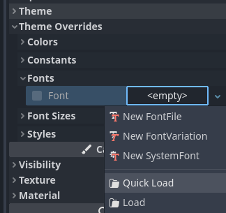
Loading a font file
You can also drag-and-drop a font file from the FileSystem dock to the inspector property that accepts a Font resource.
Avvertimento
In Godot 4.0 and later, texture filter and repeat properties are defined in the location where the texture is used, rather than on the texture itself. This also applies to fonts (both dynamic fonts and bitmap fonts).
Fonts that have a pixel art appearance should have bilinear filtering disabled by changing the Rendering > Textures > Canvas Textures > Default Texture Filter project setting to Nearest.
The font size must also be an integer multiple of the design size (which varies on a per-font basis), and the Control node using the font must be scaled by an integer multiple as well. Otherwise, the font may look blurry. Font sizes in Godot are specified in pixels (px), not points (pt). Keep this in mind when comparing font sizes across different software.
The texture filter mode can also be set on individual nodes that inherit from CanvasItem by setting CanvasItem.texture_filter.
Font outlines and shadows
Font outlines and shadows can be used to improve readability when the background color isn't known in advance. For instance, this is the case for HUD elements that are drawn over a 2D/3D scene.
Font outlines are available in most nodes that derive from Control, in addition to Label3D.
To enable outline for a font on a given node, configure the theme overrides Font Outline Color and Outline Size in the inspector. The result should look like this:
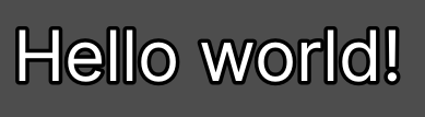
Font outline example
Nota
If using a font with MSDF rendering, its MSDF Pixel Range import option be set to at least twice the value of the outline size for outline rendering to look correct. Otherwise, the outline may appear to be cut off earlier than intended.
Support for font shadows is more limited: they are only available in Label and RichTextLabel. Additionally, font shadows always have a hard edge (but you can reduce their opacity to make them look more subtle). To enable font shadows on a given node, configure the Font Shadow Color, Shadow Offset X, and Shadow Offset Y theme overrides in a Label or RichTextLabel node accordingly:
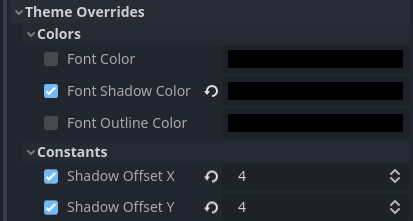
Configuring font shadow in a Label node
The result should look like this:
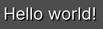
Esempio di ombra di font
Suggerimento
You can create local overrides to font display in Label nodes by creating a LabelSettings resource that you reuse across Label nodes. This resource takes priority over theme properties.
Advanced font features
Antialiasing
You can adjust how the font should be smoothed out when rendering by adjusting antialiasing and hinting. These are different properties, with different use cases.
Antialiasing controls how glyph edges should be smoothed out when rasterizing the font. The default antialiasing method (Grayscale) works well on every display technology. However, at small sizes, grayscale antialiasing may result in fonts looking blurry.
The antialiasing sharpness can be improved by using LCD subpixel optimization, which exploits the subpixel patterns of most LCD displays by offsetting the font antialiasing on a per-channel basis (red/green/blue). The downside is that this can introduce "fringing" on edges, especially on display technologies that don't use standard RGB subpixels (such as OLED displays).
In most games, it's recommended to stick to the default Grayscale antialiasing. For non-game applications, LCD subpixel optimization is worth exploring.
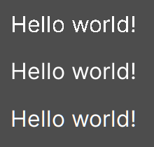
From top to bottom: Disabled, Grayscale, LCD Subpixel (RGB)
Nota
Antialiasing cannot be changed on MSDF-rendered fonts – these are always rendered with grayscale antialiasing.
Hinting
Hinting controls how aggressively glyph edges should be snapped to pixels when rasterizing the font. None results in the smoothest appearance, which can make the font look blurry at small sizes. Light (default) is sharper by snapping glyph edges to pixels on the Y axis only, while Full is even sharper by snapping glyph edges to pixels on both X and Y axes. Depending on personal preference, you may prefer using one hinting mode over the other.
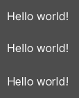
From top to bottom: None, Light, Full hinting
Nota
If changing the hinting mode has no visible effect after clicking Reimport, it's usually because the font doesn't include hinting instructions. This can be resolved by looking for a version of the font file that includes hinting instructions, or enabling Force Autohinter in the Import dock. This will use FreeType's autohinter to automatically add hinting instructions to the imported font.
Subpixel positioning
Il posizionamento subpixel può essere regolato. Questa è una funzionalità di FreeType che consente di renderizzare i glifi in modo più fedele alla loro forma originale. L'impostazione predefinita Auto abilita automaticamente il posizionamento subpixel per le piccole dimensioni, ma lo disabilita per le dimensioni grandi di font per migliorare le prestazioni di rasterizzazione.
È possibile forzare la modalità di posizionamento subpixel su Disabled, One half of a pixel o One quarter of a pixel. One quarter of a pixel offre la qualità migliore, al costo di tempi di rasterizzazione più lunghi.
Cambiare l'antialiasing, l'hinting e il posizionamento subpixel ha un effetto più notevole con dimensioni più piccole di font.
Avvertimento
I font con un aspetto da pixel art dovrebbero avere la modalità di posizionamento subpixel impostata su Disabled. Altrimenti, il font potrebbe apparire con dimensioni non uniformi di pixel.
Questo passaggio non è necessario per i font bitmap, poiché il posizionamento subpixel è rilevante solo per i font dinamici (che solitamente sono costituiti da elementi vettoriali).
Mipmap
Normalmente, i font non generano mipmap per ridurre l'utilizzo di memoria e velocizzare la rasterizzazione. Tuttavia, ciò può far apparire granulosi i font rimpiccioliti. Può essere particolarmente evidente con 3D text che non ha Fixed Size abilitato. Può verificarsi anche quando si visualizza testo con un font rasterizzato tradizionale (non MSDF) in un nodo Control con una scala inferiore a (1, 1).
Dopo aver selezionato un font nel pannello FileSystem, è possibile abilitare Mipmaps nel pannello Importazione per migliorare l'aspetto di rendering dei font rimpiccioliti.
Mipmaps can be enabled on MSDF fonts as well. This can improve font rendering quality a little at smaller-than-default sizes, but MSDF fonts are already resistant to graininess out of the box.
Rendering di font MSDF
Il rendering di font MSDF (Multi-channel Signed Distance Field) consente di renderizzare i font in qualsiasi dimensione, senza doverli rasterizzare nuovamente quando ne cambiano le dimensioni.
Il rendering di font MSDF ha due vantaggi rispetto alla rasterizzazione tradizionale dei font, che Godot utilizza come predefinito:
Il font apparirà sempre nitido, anche se scritto in enormi dimensioni.
Si verifica meno stuttering quando si renderizzano caratteri in grandi dimensioni di font per la prima volta, poiché nessuna rasterizzazione viene eseguita.
Gli svantaggi del rendering di font MSDF sono:
Costo di base più elevato per renderizzare i font. Questo solitamente non si nota sulle piattaforme desktop, ma può avere un impatto sui dispositivi mobili di fascia bassa.
I font di piccole dimensioni non appariranno chiari come i font rasterizzati, a causa della mancanza di hinting.
Renderizzare nuovi glifi per la prima volta con dimensioni ridotte di font potrebbe risultare più costoso rispetto ai tradizionali font rasterizzati. Prerendering di font si può utilizzare per rimediare.
L'ottimizzazione subpixel LCD non può essere abilitata per i font MSDF.
I font con contorni autointersecanti non saranno visualizzati correttamente in modalità MSDF. Se si riscontrano problemi di rendering con font scaricati da siti web come Google Fonts, provare a scaricare il font dal sito web ufficiale dell'autore.
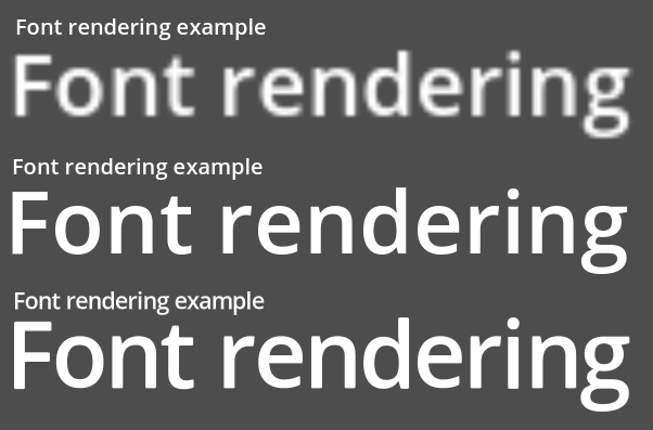
Confronto tra i metodi di rasterizzazione dei font. Dall'alto verso il basso: rasterizzazione senza sovracampionamento, rasterizzazione con sovracampionamento, MSDF
Per abilitare il rendering MSDF per un determinato font, selezionarlo nel pannello FileSystem, andare al pannello Importazione, abilitare Multichannel Signed Distance Field, quindi cliccare su Reimporta:
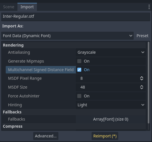
Abilitazione di MSDF nelle opzioni di importazione del font
Usare le emoji
Godot supporta in modo limitato i font emoji:
Sono supportati i font CBDT/CBLC (PNG incorporati) e gli emoji SVG.
I font emoji COLR/CPAL (formato vettoriale personalizzato) non sono supportati.
La compressione delle immagini bitmap EMJC (utilizzata dal font emoji di sistema di iOS) non è supportata. Ciò significa che per supportare le emoji su iOS, è necessario utilizzare un font personalizzato che utilizzi invece la compressione bitmap SVG o PNG.
Affinché Godot possa visualizzare gli emoji, il font utilizzato (o uno dei suoi fallback) deve includerli. Altrimenti, gli emoji non saranno visualizzati e al loro posto appariranno i caratteri segnaposto "tofu":

Aspetto predefinito quando si tenta di utilizzare emoji in un'etichetta
Dopo aver aggiunto un font per visualizzare le emoji, ad esempio Noto Color Emoji, si ottiene il risultato previsto:

Aspetto corretto dopo aver aggiunto un font emoji all'etichetta
To use a regular font alongside emoji, it's recommended to specify a fallback font that points to the emoji font in the regular font's advanced import options. If you wish to use the default project font while displaying emoji, leave the Base Font property in FontVariation empty while adding a font fallback pointing to the emoji font:
Suggerimento
I font emoji sono piuttosto grandi, quindi potresti voler caricare un font di sistema per fornire glifi di emoji invece di includerlo nel progetto. Questo permette di fornire il pieno supporto per gli emoji nel progetto senza aumentare le dimensioni del PCK esportato. Lo svantaggio è che gli emoji avranno un aspetto diverso a seconda della piattaforma e il caricamento dei font di sistema non è supportato su tutte le piattaforme.
È possibile utilizzare anche un font di sistema come font di riserva.
Using icon fonts
Strumenti come Fontello si possono utilizzare per generare file di font contenenti vettori importati da file SVG. Ciò si può utilizzare per visualizzare elementi vettoriali personalizzati come parte del testo o per creare icone 3D estruse con 3D text e TextMesh.
Nota
Fontello attualmente non supporta la creazione di font multicolore (che Godot può renderizzare). A novembre 2022, il supporto per i font multicolore negli strumenti di generazione di font icona rimane scarso.
A seconda dei casi d'uso, questo potrebbe portare a risultati migliori rispetto all'utilizzo del tag img in RichTextLabel. A differenza delle immagini bitmap (inclusi gli SVG che sono rasterizzati durante l'importazione da Godot), i veri dati vettoriali si possono ridimensionare a qualsiasi dimensione senza perdere qualità.
Dopo aver scaricato il file del font generato, caricare nel progetto Godot e specificarlo come font personalizzato per un nodo Label, RichTextLabel o Label3D. Passare all'interfaccia web di Fontello, quindi copiare il carattere selezionandolo e premendo Ctrl + C (Cmd + C su macOS). Incollare il carattere nella proprietà Text del nodo Label. Il carattere apparirà come glifo segnaposto nell'ispettore, ma dovrebbe apparire correttamente nella viewport 2D/3D.
To use an icon font alongside a traditional font in the same Control, you can specify the icon font as a fallback. This works because icon fonts use the Unicode private use area, which is reserved for use by custom fonts and doesn't contain standard glyphs by design.
Nota
Diversi font di icone moderni, come Font Awesome 6, hanno una variazione desktop che utilizza le legature per specificare icone. Questo consente di specificare icone inserendone il nome direttamente nella proprietà Text di qualsiasi nodo che possa visualizzare font. Una volta inserito il nome dell'icona come testo completo (ad esempio house), verrà sostituito dall'icona.
While easier to use, this approach cannot be used with font fallbacks as the main font's characters will take priority over the fallback font's ligatures.
Font fallbacks
Godot supports defining one or more fallbacks when the main font lacks a glyph to be displayed. There are 2 main use cases for defining font fallbacks:
Use a font that only supports Latin character sets, but use another font to be able to display text another character set such as Cyrillic.
Use a font to render text, and another font to render emoji or icons.
Aprire la finestra di dialogo Impostazioni di importazione avanzate facendo doppio clic sul file del font nel pannello FileSystem. È possibile anche selezionare il font nel pannello FileSystem, andare al pannello Importazione e scegliere Avanzate… in basso:
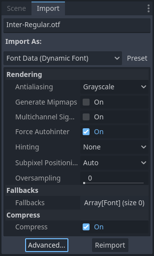
Pannello Importazione
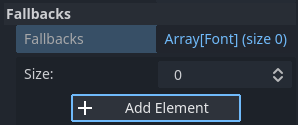
In the dialog that appears, look for Fallbacks section on the sidebar on the right, click the Array[Font] (size 0) text to expand the property, then click Add Element:
Adding font fallback
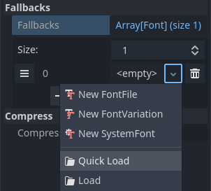
Click the dropdown arrow on the new element, then choose a font file using the Quick Load or Load options:
Loading font fallback
It is possible to add fallback fonts while using the default project font. To do so, leave the Base Font property empty while adding one or more font fallbacks.
Nota
Font fallbacks can also be defined on a local basis similar to Funzionalità OpenType di font, but this is not covered here for brevity reasons.
Font variabili
Godot supporta pienamente i font variabili, che consentono di utilizzare un singolo file di font per rappresentare diversi pesi e stili (normale, grassetto, corsivo, ecc.). Questa funzionalità deve essere supportata dal file di font utilizzato.
Per utilizzare un font variabile, creare una risorsa FontVariation nel posto in cui si intende utilizzare il font, quindi caricare un file di font dentro la risorsa FontVariation:
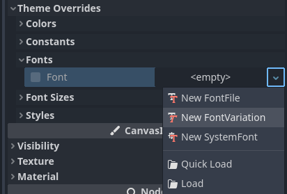
Creare una risorsa FontVariation
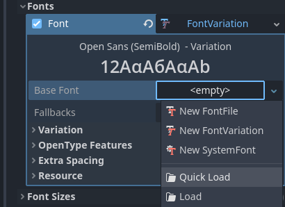
Caricamento di un file di font nella risorsa FontVariation
Scorrere in basso fino alla sezione Variazione di FontVariation, quindi cliccare sul testo Coordinate di variazione per espandere l'elenco degli assi che si possono modificare:
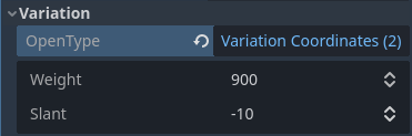
Elenco di assi di variazione
L'insieme di assi che è possibile regolare dipende dal font caricato. Alcuni font variabili supportano un solo asse di regolazione (in genere peso o inclinazione), mentre altri possono supportare più assi di regolazione.
Ad esempio, ecco il font Inter V con un peso di 900 e un'inclinazione di -10:

Esempio di font variabile (Inter V)
Suggerimento
Sebbene i nomi e le scale degli assi dei font variabili non siano standardizzati, i designer di font solitamente seguono alcune convenzioni comuni. L'asse weight è standardizzato in OpenType per funzionare come segue:
Valore di asse |
Peso effettivo del font |
|---|---|
|
Sottile (capello) |
|
Extra Light (Ultra Light) |
|
Lieve |
|
Regolare (Normale) |
|
Medio |
|
Semi-Bold (Demi-Bold) |
|
Grassetto |
|
Extra Bold (Ultra Bold) |
|
Black (Heavy) |
|
Extra Black (Ultra Black) |
È possibile salvare il FontVariation in un file risorsa .tres per riutilizzarlo in altri posti:
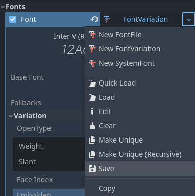
Salvataggio di FontVariation in un file risorsa esterno
Faux bold and italic
When writing text in bold or italic, using font variants specifically designed for this looks better. Spacing between glyphs will be more consistent when using a bold font, and certain glyphs' shapes may change entirely in italic variants (compare "a" and "a").
Tuttavia, i font in grassetto e corsivo richiedono la distribuzione di più file, il che aumenta le dimensioni della distribuzione. È possibile utilizzare anche un singolo file di font variabile, ma questo file sarà più grande di un singolo font non variabile. Sebbene la dimensione del file non siano solitamente un problema per i progetti desktop, possono esserlo per i progetti mobile/web che si sforzano di mantenere la dimensione della distribuzione il più ridotta possibile.
To allow bold and italic fonts to be displayed without having to ship additional fonts (or use a variable font that is larger in size), Godot supports faux bold and italic.
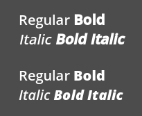
Faux bold/italic (top), real bold/italic (bottom). Normal font used: Open Sans SemiBold
Faux bold and italic is automatically used in RichTextLabel's bold and italic tags if no custom fonts are provided for bold and/or italic.
To use faux bold, create a FontVariation resource in a property where a Font
resource is expected. Set Variation > Embolden to a positive value to make a
font bolder, or to a negative value to make it less bold. Recommended values are
between 0.5 and 1.2 depending on the font.
Faux italic is created by skewing the text, which is done by modifying the
per-character transform. This is also provided in FontVariation using the
Variation > Transform property. Setting the yx component of the
character transform to a positive value will italicize the text. Recommended
values are between 0.2 and 0.4 depending on the font.
Aggiuntare la spaziatura di font
Per motivi stilistici o per una migliore leggibilità, si potrebbe voler modificare il modo in cui un font è presentato in Godot.
Create a FontVariation resource in a property where a Font resource is expected. There are 4 properties available in the Variation > Extra Spacing section, which accept positive and negative values:
Glifo: spaziatura aggiuntiva tra ogni glifo.
Spazio: spaziatura aggiuntiva tra le parole.
Alto: spaziatura aggiuntiva sopra i glifi. È utilizzata per il testo su più righe, ma anche per calcolare la dimensione minima di controlli come Label e Button.
Basso: spaziatura aggiuntiva sotto i glifi. È utilizzata per il testo su più righe, ma anche per calcolare la dimensione minima di controlli come Label e Button.
The Variation > Transform property can also be adjusted to stretch
characters horizontally or vertically. This is specifically done by adjusting
the xx (horizontal scale) and yy (vertical scale) components. Remember
to adjust glyph spacing to account for any changes, as glyph transform doesn't
affect how much space each glyph takes in the text. Non-uniform scaling of this
kind should be used sparingly, as fonts are generally not designed to be
displayed with stretching.
Funzionalità OpenType di font
Godot supports enabling OpenType font features, which are a standardized way to
define alternate characters that can be toggled without having to swap font
files entirely. Despite being named OpenType font features, these are also
supported in TrueType (.ttf) and WOFF/WOFF2 font files.
Support for OpenType features highly depends on the font used. Some fonts don't support any OpenType features, while other fonts can support dozens of toggleable features.
Esistono 2 modi per utilizzare le funzionalità OpenType di un font:
Globalmente su un file di font
Aprire la finestra di dialogo Impostazioni di importazione avanzate facendo doppio clic sul file del font nel pannello FileSystem. È possibile anche selezionare il font nel pannello FileSystem, andare al pannello Importazione e scegliere Avanzate… in basso:
Pannello Importazione
In the dialog that appears, look for the Metadata Overrides > OpenType Features section on the sidebar on the right, click the Features (0 of N set) text to expand the property, then click Add Feature:
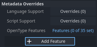
Sostituzioni delle funzionalità OpenType nelle Impostazioni di importazione avanzate
In un utilizzo specifico del font (FontVariation)
Per utilizzare una funzionalità di un font, creare una risorsa FontVariation come si farebbe per un font variabile, quindi caricare un file font dentro la risorsa FontVariation:
Creare una risorsa FontVariation
Caricamento di un file di font in una risorsa FontVariation
Scroll down to the FontVariation's OpenType Features section, click the Features (0 of N set) text to expand the property, then click Add Feature and select the desired feature in the dropdown:

Specifica delle funzionalità OpenType in una risorsa FontVariation
For example, here's the Inter font without the Slashed Zero feature (top), then with the Slashed Zero OpenType feature enabled (bottom):
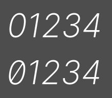
Confronto di funzionalità OpenType (Inter)
È possibile disattivare le legature e/o la crenatura per un font specifico aggiungendo funzionalità OpenType e deselezionandole nell'ispettore:
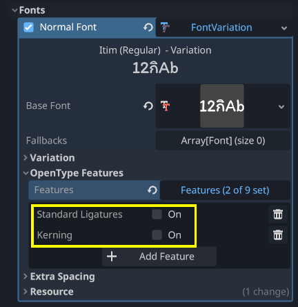
Disabilitazione delle legature e della crenatura per un font
Font di sistema
Avvertimento
Il caricamento dei font di sistema è supportato solo su Windows, macOS, Linux, Android e iOS.
However, loading system fonts on Android is unreliable as there is no official API for doing so. Godot has to rely on parsing system configuration files, which can be modified by third-party Android vendors. This may result in non-functional system font loading.
I font di sistema sono un tipo di risorsa diverso rispetto ai font importati. Non sono mai realmente importati nel progetto, ma caricati in fase di esecuzione. Ciò offre due vantaggi:
I font non sono inclusi nel file PCK esportato, il che porta a una dimensione più piccola di file per il progetto esportato.
Poiché i font non sono inclusi nel progetto esportato, si evitano problemi di licenza che potrebbero verificarsi se i font di sistema proprietari venissero distribuiti insieme al progetto.
The engine automatically uses system fonts as fallback fonts, which makes it possible to display CJK characters and emoji without having to load a custom font. There are some restrictions that apply though, as mentioned in the Using emoji section.
Creare una risorsa SystemFont nel posto in cui si desidera utilizzare il font di sistema:
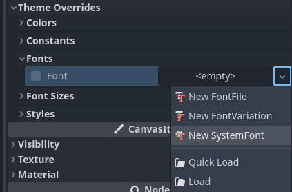
Creare una risorsa SystemFont
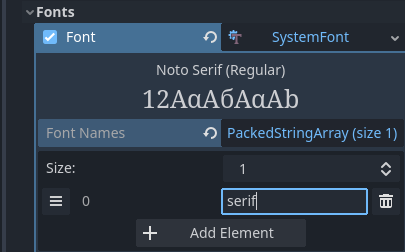
Specifying a font name to use in a SystemFont resource
È possibile specificare esplicitamente uno o più nomi di font (ad esempio Arial) oppure specificare il nome di un alias di font che corrisponde a un font predefinito "standard" per il sistema:
Alias del font |
Windows |
macOS/iOS |
Linux |
Android |
|---|---|---|---|---|
|
Arial |
Helvetica |
Gestito da fontconfig |
Roboto / Noto Sans |
|
Times New Roman |
Times |
Gestito da fontconfig |
Noto Serif |
|
Courier New |
Courier |
Gestito da fontconfig |
Droid Sans Mono |
|
Comic Sans MS |
Apple Chancery |
Gestito da fontconfig |
Dancing Script |
|
Gabriola |
Papyrus |
Gestito da fontconfig |
Droid Sans Mono |
Su Android, Roboto è utilizzato per i testi in latino/cirillico e Noto Sans per i glifi di altre lingue, come il CJK. Nelle distribuzioni Android di terze parti, la selezione esatta del font potrebbe differire.
Se si specifica più di un font, sarà utilizzato il primo font trovato nel sistema (dall'alto verso il basso). I nomi dei font e gli alias non distinguono tra maiuscole e minuscole su tutte le piattaforme.
Like for font variations, you can save the SystemFont arrangement to a resource file to reuse it in other places.
Remember that different system fonts have different metrics, which means that text that can fit within a rectangle on one platform may not be doing so on another platform. Always reserve some additional space during development so that labels can extend further if needed.
Nota
A differenza di Windows e macOS/iOS, l'insieme di font predefiniti fornito su Linux dipende dalla distribuzione. Ciò significa che su diverse distribuzioni Linux potrebbero essere visualizzati font diversi per un determinato nome o alias di font di sistema.
È anche possibile caricare i font in fase di esecuzione, anche se non sono installati sul sistema. Consultare Caricamento e salvataggio in fase di esecuzione per i dettagli.
Prerendering di font
When using traditional rasterized fonts, Godot caches glyphs on a per-font and per-size basis. This reduces stuttering, but it can still occur the first time a glyph is displayed when running the project. This can be especially noticeable at higher font sizes or on mobile devices.
When using MSDF fonts, they only need to be rasterized once to a special signed distance field texture. This means caching can be done purely on a per-font basis, without taking the font size into consideration. However, the initial rendering of MSDF fonts is slower compared to a traditional rasterized font at a medium size.
To avoid stuttering issues related to font rendering, it is possible to prerender certain glyphs. This can be done for all glyphs you intend to use (for optimal results), or only for common glyphs that are most likely to appear during gameplay (to reduce file size). Glyphs that aren't pre-rendered will be rasterized on-the-fly as usual.
Nota
In both cases (traditional and MSDF), font rasterization is done on the CPU. This means that the GPU performance doesn't affect how long it takes for fonts to be rasterized.
Aprire la finestra di dialogo Impostazioni di importazione avanzate facendo doppio clic sul file del font nel pannello FileSystem. È possibile anche selezionare il font nel pannello FileSystem, andare al pannello Importazione e scegliere Avanzate… in basso:
Pannello Importazione
Move to the Pre-render Configurations tab of the Advanced Import Settings dialog, then add a configuration by clicking the "plus" symbol:

Adding a new prerendering configuration in the Advanced Import Settings dialog
After adding a configuration, make sure it is selected by clicking its name once. You can also rename the configuration by double-clicking it.
There are 2 ways to add glyphs to be prerendered to a given configuration. It is possible to use both approaches in a cumulative manner:
Utilizzo di testo dalle traduzioni
For most projects, this approach is the most convenient to use, as it automatically sources text from your language translations. The downside is that it can only be used if your project supports internationalization. Otherwise, stick to the "Using custom text" approach described below.
After adding translations to the Project Settings, use the Glyphs from the Translations tab to check translations by double-clicking them, then click Shape All Strings in the Translations and Add Glyphs at the bottom:
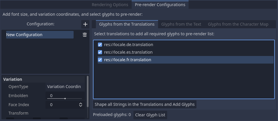
Enabling prerendering in the Advanced Import Settings dialog with the Glyphs from the Translations tab
Nota
The list of prerendered glyphs is not automatically updated when translations are updated, so you need to repeat this process if your translations have changed significantly.
Utilizzo di testo personalizzato
While it requires manually specifying text that will appear in the game, this is the most efficient approach for games which don't feature user text input. This approach is worth exploring for mobile games to reduce the file size of the distributed app.
To use existing text as a baseline for prerendering, go to the Glyphs from the Text sub-tab of the Advanced Import Settings dialog, enter text in the window on the right, then click Shape Text and Add Glyphs at the bottom of the dialog:
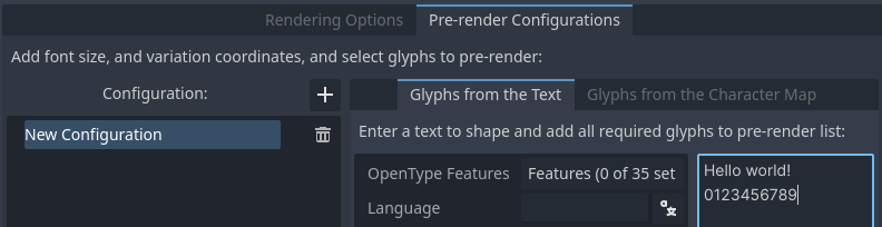
Enabling prerendering in the Advanced Import Settings dialog with the Glyphs from the Text tab
Suggerimento
If your project supports internationalization, you can paste the contents of your CSV or PO files in the above box to quickly prerender all possible characters that may be rendered during gameplay (excluding user-provided or non-translatable strings).
Abilitando i set di caratteri
The second method requires less configuration and fewer updates if your game's text changes, and is more suited to text-heavy games or multiplayer games with chat. On the other hand, it may cause glyphs that never show up in the game to be prerendered, which is less efficient in terms of file size.
To use existing text as a baseline for prerendering, go to the Glyphs from the Character Map sub-tab of the Advanced Import Settings dialog, then double-click character sets to be enabled on the right:
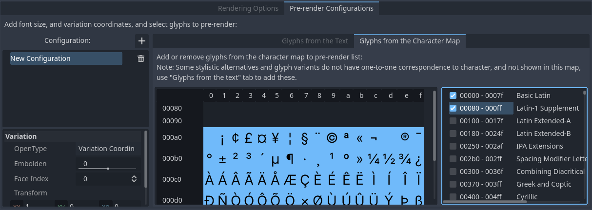
Enabling prerendering in the Advanced Import Settings dialog with the Glyphs from the Character Map tab
To ensure full prerendering, the character sets you need to enable depend on which languages are supported in your game. For English, only Basic Latin needs to be enabled. Enabling Latin-1 Supplement as well allows fully covering many more languages, such as French, German and Spanish. For Russian, Cyrillic needs to be enabled, and so on.
Proprietà del font predefinito di un progetto
In the GUI > Theme section of the advanced Project Settings, you can choose how the default font should be rendered:
Default Font Antialiasing: Controls the antialiasing method used for the default project font.
Default Font Hinting: Controls the hinting method used for the default project font.
Default Font Subpixel Positioning: Controls the subpixel positioning method for the default project font.
Default Font Multichannel Signed Distance Field: If
true, makes the default project font use MSDF font rendering instead of traditional rasterization.Default Font Generate Mipmaps: If
true, enables mipmap generation and usage for the default project font.
Nota
These project settings only affect the default project font (the one that is hardcoded in the engine binary).
Custom fonts' properties are governed by their respective import options instead. You can use the Import Defaults section of the Project Settings dialog to override default import options for custom fonts.