GUI tutorial
Introduction
If there is something that most programmers hate with passion, it is programming graphical user interfaces (GUIs). It’s boring, tedious and unchallenging. Several aspects make matters worse, such as:
- Pixel alignment of UI elements is difficult (such that it looks just like the designer intends).
- UIs are changed constantly due to design and usability issues that appear during testing.
- Handling proper screen re-sizing for different display resolutions.
- Animating several screen components, to make it look less static.
GUI programming is one of the leading causes of programmer burnout. During the development of Godot (and previous engine iterations), several techniques and philosophies for UI development were put into practice, such as immediate mode, containers, anchors, scripting, etc. This was always done with the main goal of reducing the stress programmers had to face while putting together user interfaces.
In the end, the resulting UI subsystem in Godot is an efficient solution to this problem, and works by mixing together a few different approaches. While the learning curve is a little steeper than in other toolkits, developers can put together complex user interfaces in very little time, by sharing the same set of tools with designers and animators.
Control
The basic node for UI elements is Control (sometimes called “Widget” or “Box” in other toolkits). Every node that provides user interface functionality descends from it.
When controls are put in a scene tree as a child of another control, its coordinates (position, size) are always relative to the parent. This sets the basis for editing complex user interfaces quickly and visually.
Input and drawing
Controls receive input events by means of the Control._input_event() callback. Only one control, the one in focus, will receive keyboard/joypad events (see Control.set_focus_mode() and Control.grab_focus()).
Mouse motion events are received by the control directly below the mouse pointer. When a control receives a mouse button pressed event, all subsequent motion events are received by the pressed control until that button is released, even if the pointer moves outside the control boundary.
Like any class that inherits from CanvasItem (Control does), a CanvasItem._draw() callback will be received at the beginning and every time the control needs to be redrawn (the programmer needs to call CanvasItem.update() to enqueue the CanvasItem for redraw). If the control is not visible (yet another CanvasItem property), the control does not receive any input.
In general though, the programmer does not need to deal with drawing and input events directly when building UIs (that is more useful when creating custom controls). Instead, controls emit different kinds of signals with contextual information for when action occurs. For example, a Button emits a “pressed” signal when pressed, a Slider will emit a “value_changed” when dragged, etc.
Custom control mini tutorial
Before going into more depth, creating a custom control will be a good way to get the picture on how controls works, as they are not as complex as it might seem.
Additionally, even though Godot comes with dozens of controls for different purposes, it happens often that it’s easier to attain a specific functionality by creating a new one.
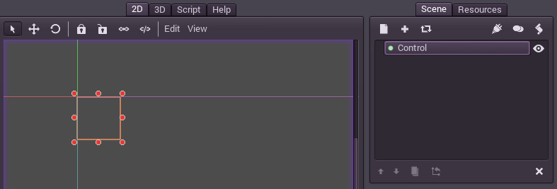
To begin, create a single-node scene. The node is of type “Control” and has a certain area of the screen in the 2D editor, like this:
Add a script to that node, with the following code:
extends Control

var tapped=false

func _draw():

    var r = Rect2( Vector2(), get_size() )
    if (tapped):
        draw_rect(r, Color(1,0,0) )
    else:
        draw_rect(r, Color(0,0,1) )

func _input_event(ev):

    if (ev.type==InputEvent.MOUSE_BUTTON and ev.pressed):
        tapped=true
        update()
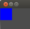
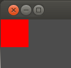
Then run the scene. When the rectangle is clicked/tapped, it will change color from blue to red. That synergy between the events and the drawing is pretty much how most controls work internally.
UI complexity
As mentioned before, Godot includes dozens of controls ready for use in a user interface. Such controls are divided in two categories. The first is a small set of controls that work well for creating most game user interfaces. The second (and most controls are of this type) are meant for complex user interfaces and uniform skinning through styles. A description is presented as follows to help understand which one should be used in which case.
Simplified UI controls
This set of controls is enough for most games, where complex interactions or ways to present information are not necessary. They can be skinned easily with regular textures.
- Label: Node used for showing text.
- TextureFrame: Displays a single texture, which can be scaled or kept fixed.
- TextureButton: Displays a simple textured button, states such as pressed, hover, disabled, etc. can be set.
- TextureProgress: Displays a single textured progress bar.
Additionally, re-positioning of controls is most efficiently done with anchors in this case (see the Size and anchors tutorial for more information).
In any case, it will happen often that even for simple games, more complex UI behaviors are required. An example of this is a scrolling list of elements (for a high score table, for example), which needs a ScrollContainer and a VBoxContainer. These kind of more advanced controls can be mixed with the regular ones seamlessly (they are all controls after all).
Complex UI controls
The rest of the controls (and there are dozens of them!) are meant for another set of scenarios, most commonly:
- Games that require complex UIs, such as PC RPGs, MMOs, strategy, sims, etc.
- Creating custom development tools to speed up content creation.
- Creating Godot Editor Plugins, to extend the engine functionality.
Re-positioning controls for these kind of interfaces is more commonly done with containers (see the Size and anchors tutorial for more information).