Design a title screen
In the next two tutorials, you will build two responsive UI (user interface) scenes step-by-step using the engine's UI system:
A main menu.
A game UI with a health bar, energy bar, bomb and money counters.
You will learn how to design game UIs efficiently, and how to use Godot's Control nodes. This page focuses on the visual part: everything you do from the editor. To learn how to code a life bar, read Control the game's UI with code.
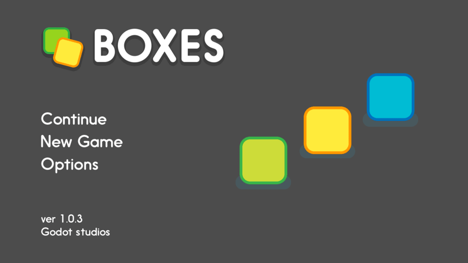
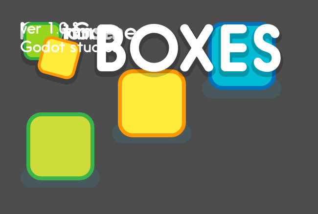
The GUI you're going to create.
Download the project files: ui_main_menu_design.zip and extract the archive. Import the start/
project in Godot to follow this tutorial. The end/ folder contains the
final result. You'll find all the sprites in the start/assets/main_menu
folder.
Note
Read the Design interfaces with the Control nodes first to learn how Godot's UI system works.
How to design your game UI
To design a good UI, you want to come up with a rough mockup first: a plain drawing version that focuses on the placement of your UI components, their size, and user interaction. Pen and paper is all you need. You shouldn't use fancy and final graphics at this stage. Then, you only need simple placeholder sprites and you're good to jump into Godot. You want to make sure the players can find their way around the interface using those placeholders.
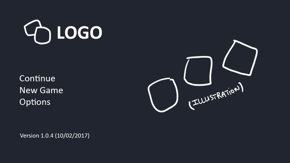
The UI's rough plan or mockup
Placeholder doesn't have to mean ugly, but you should keep the graphics simple and clean. Avoid special effects, animation, and detailed illustration before you have players playtest your UI. Otherwise:
The graphics might skew the players' perception of the experience and you'll miss out on valuable feedback.
If the User Experience doesn't work, you'll have to redo some sprites.
Tip
Always try to make the interface work with simple text and boxes first. It's easy to replace the textures later. Professional UX designers often work with plain outlines and boxes in greyscale. When you take colors and fancy visuals away, it's a lot easier to size and place UI elements properly. It helps you refine the design foundation you'll build upon.
There are two ways to design your UI in Godot. You can:
Build it all in a single scene, and eventually save some branches as reusable scenes.
Build template scenes for reusable components and create specific components that inherit from your base scenes.
We will use the first approach, because the first version of your UI may not work as well as you'd like. You're likely to throw parts away and redesign components as you go. When you're sure everything works, it's easy to make some parts reusable, as you'll see below.
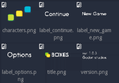
The files you'll find in Godot. The graphics look cleaner than on the rough design, but they're still placeholders.
Design the main menu
Before we jump into the editor, we want to plan how we'll nest containers based on our mockup image.
Break down the UI mockup
Here are my three rules of thumb to find the right containers:
Break down the UI into nested boxes, from the largest that contains everything, to the smallest ones, that encompass one widget, like a bar with its label, a panel or a button.
If there's some padding around an area, use a
MarginContainer.If the elements are arranged in rows or columns, use an
HBoxContainerorVBoxContainer.
These rules are enough to get us started, and work well for simple interfaces.
For the main menu, the largest box is the entire game window. There's
padding between the edges of the window and the first components: this
should be a MarginContainer. Then, the screen is split into two
columns, so we'll use an HBoxContainer. In the left column, we'll
manage the rows with a VBoxContainer. And in the right column, we'll
center the illustration with a CenterContainer.
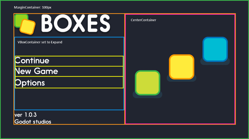
Interface building blocks, broken down using the three rules of thumb.
Tip
Containers adapt to the window's resolution and width-to-height ratio. Although we could place UI elements by hand, containers are faster, more precise, and responsive.
Add the UI sprites
Select the MarginContainer, and create the UI elements as
TextureRect nodes. We need:
the title or logo,
the three text options as individual nodes,
the version note,
and the main menu's illustration.
Click the Add Node button or press Ctrl + A (Cmd + A on macOS) on your keyboard.
Start to type TextureRect to find the corresponding node and press
enter. With the new node selected, press Ctrl + D (Cmd + D on macOS) five times to
create five extra TextureRect instances.
Click each of the nodes to select it. In the inspector, find the Texture property and click [empty] > Load. A file browser opens and lets you pick a sprite to load into the texture slot.
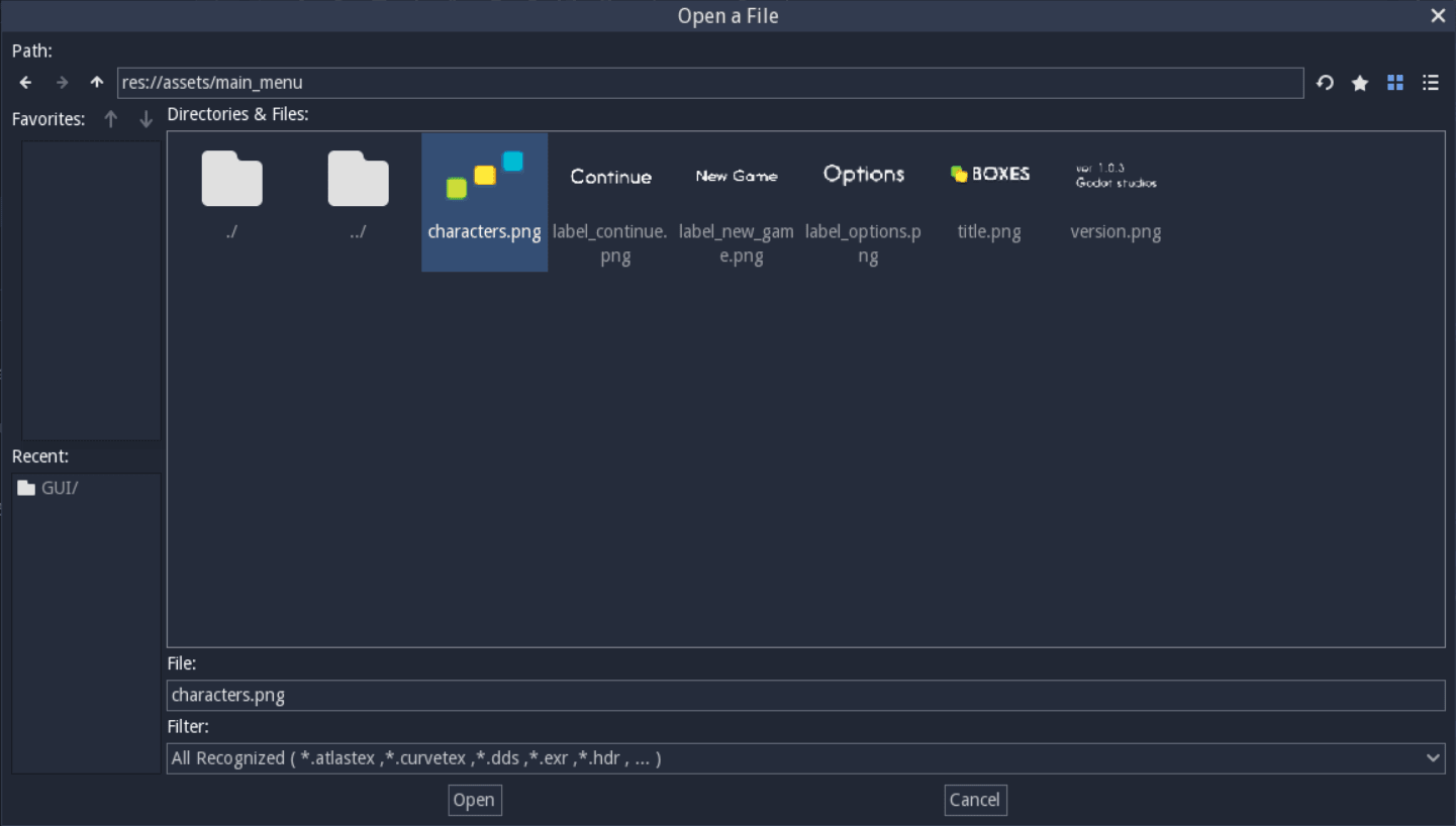
The file browser lets you find and load textures.
Repeat the operation for all TextureRect nodes. You should have the
logo, the illustration, the three menu options and the version note,
each as a separate node. Then, double click on each of the nodes in the
Scene tab to rename them. Nothing has been placed in containers yet so this
should look messy.
The six nodes with textures loaded.
Note
If you want to support localization in your game, use
Labels for menu options instead of TextureRect.
Add containers to place UI elements automatically
Our main menu has some margin around the edges of the screen. It is
split in two parts: on the left, you have the logo and the menu options.
On the right, you have the characters. We can use one of two containers
to achieve this: HSplitContainer or HBoxContainer. Split
containers split the area into two: a left and a right side or a top and
a bottom side. They also allow the user to resize the left and right
areas using an interactive bar. On the other hand, HBoxContainer
just splits itself into as many columns as it has children. Although you
can deactivate the split container's resize behavior, it's recommended to
favor box containers.
Select the MarginContainer and add an HBoxContainer. Then, we
need two containers as children of our HBoxContainer: a
VBoxContainer for the menu options on the left, and a
CenterContainer for the illustration on the right.
You should have four nested containers and the TextureRect nodes sitting aside from it.
In the node tree, select all the TextureRect nodes that should go on the
left side: the logo, the menu options (Continue, NewGame, Options), and the
version note. Drag and drop them into the VBoxContainer. The nodes should
position automatically.
Containers automatically place and resize textures
We're left with two problems to solve:
The characters on the right aren't centered.
There's no space between the logo and the other UI elements.
To center the characters on the right, first select the CenterContainer.
Then in the Inspector, scroll down to the Size Flags category and click
on the field to the right of the Vertical property, and check Expand
in addition to Fill. Do the same for the Horizontal property. This
makes the CenterContainer expand into all available space while
respecting its neighbour VBoxContainer. Finally, drag and drop the
Characters node into the CenterContainer. The Characters element will center
automatically.
The character node centers inside the right half of the screen as soon as you place it inside the CenterContainer.
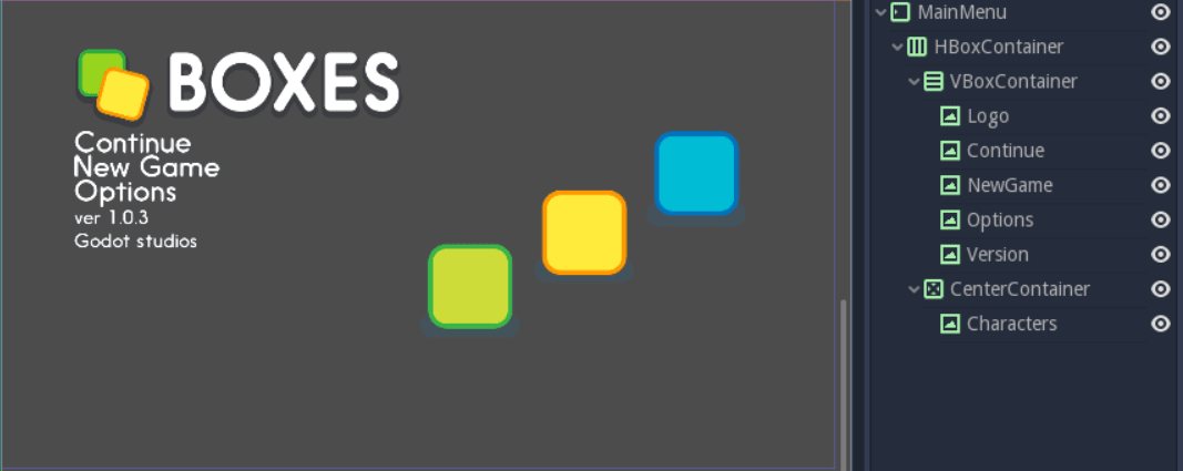
To space out the menu options and the logo on the left, we'll use one
final container and its size flags. Select the VBoxContainer and
press Ctrl + A (Cmd + A on macOS) to add a new node inside it. Add a second
VBoxContainer and name it MenuOptions. Select all three menu
options, Continue, NewGame and Options, and drag and drop
them inside the new VBoxContainer. The UI's layout should barely
change, if at all.
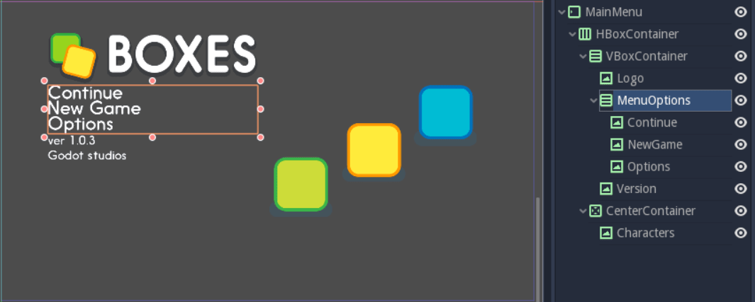
Place the new container between the other two nodes to retain the UI's layout.
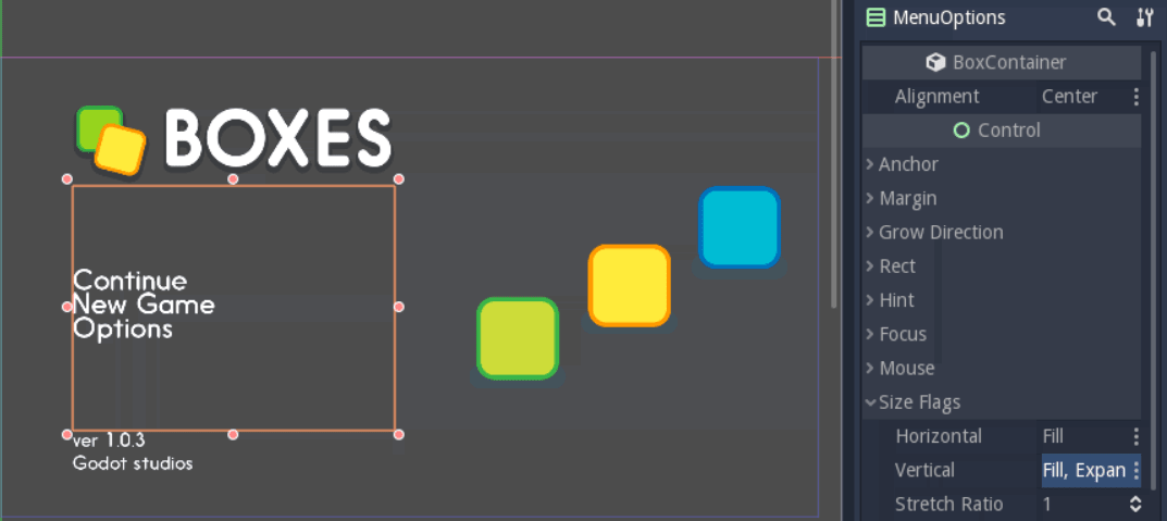
Now we grouped the menu options together, we can tell their container to
expand to take as much vertical space as possible. Select the
MenuOptions node. In the Inspector, scroll down to the
Size Flags category. Click on the field to the right of the
Vertical property, and check Expand in addition to Fill.
The container expands to take all the available vertical space
while respecting its neighbors, the Logo and Version elements.
To center the nodes in the VBoxContainer, scroll to the top of the
Inspector and change the Alignment property to Center.
The menu options should center vertically in the UI's left column.
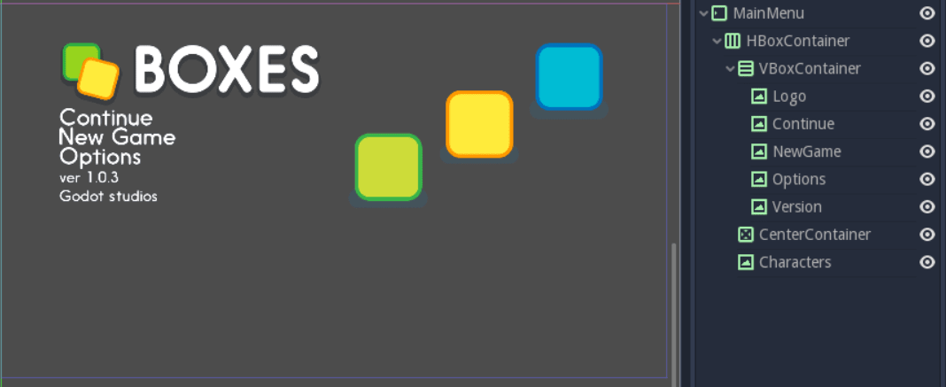
To wrap things up, let's add some separation between the menu options. Expand the Custom Constants category below Size Flags, and click the field next to the Separation parameter. Set it to 30. Once you press enter, the Separation property becomes active and Godot adds 30 pixels between menu options.
The final interface.
Without a single line of code, we have a precise and responsive main menu.
Congratulations for getting there! You can download the final
menu ui_main_menu_design.zip
to compare with your own. In the next tutorial, you'll
create a Game User Interface with bars and item counters.
Break down the UI mockup
A responsive User Interface is all about making sure our UIs scale well on all screen types. TV screens and computer displays have different sizes and ratios. In Godot, we use containers to control the position and the size of UI elements.
The order in which you nest matters. To see if your UI adapts nicely to different screen ratios, select the root node, press Q to activate the Select Mode, select the container and click and drag on one of the container's corners to resize it. The UI components should flow inside of it.
You'll notice that although containers move sprites around, they don't scale them. This is normal. We want the UI system to handle different screen ratios, but we also need the entire game to adapt to different screen resolutions. To do this, Godot scales the entire window up and down.
You can change the scale mode in the project settings: click Project > Project Settings in the top menu. In the window's left column, look for the Display category. Click on the Window sub-category. On the right side of the window, you'll find a Stretch section. The three settings, Mode, Aspect, and Shrink, control the screen size. For more information, see Multiple resolutions.