Attention: Here be dragons
This is the latest
(unstable) version of this documentation, which may document features
not available in or compatible with released stable versions of Godot.
Checking the stable version of the documentation...
Používání kontejnerů
Anchors are an efficient way to handle different aspect ratios for basic multiple resolution handling in GUIs.
Pro složitější uživatelská rozhraní však mohou být obtížně použitelná.
Toto je často případ her, jako jsou RPG, online chaty, tycoony nebo simulace. Dalším běžným případem, ve kterém mohou být vyžadovány pokročilejší funkce rozvržení, jsou nástroje zabudované přímo ve hře nebo zcela samostatné nástroje.
Všechny tyto situace vyžadují mocnější uživatelské rozhraní podobné OS, s pokročilým rozvržením a formátováním. Zde jsou užitečnější Kontejnery.
Rozvržení kontejneru
Kontejnery nám poskytují obrovskou moc nad rozvržením (například uživatelské rozhraní editoru Godota je kompletně připraveno právě pomocí kontejnerů):
Když je použit uzel odvozený z Container, vzdají se všechny podřízené uzly Control svých vlastních polohovacích možností. To znamená, že Container bude řídit jejich umístění a jakýkoliv pokus o ruční změnu těchto uzlů bude při příští změně velikosti jejich rodičů ignorován nebo zneplatněn.
A podobně, jakmile se změní velikost uzlu odvozeného z Container, budou všechny jeho podřízené uzly přemístěny podle chování použitého typu kontejneru:
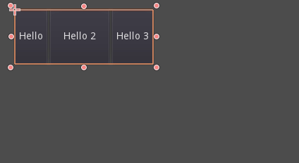
Příklad toho jak HBoxContainer mění velikost podřízených uzlů.
Skutečnou sílou kontejnerů je to, že je lze vzájemně vnořovat (jako uzly), což umožňuje jednoduše vytvářet velmi složitá rozvržení, která bez problémů mění velikost.
Sizing options
When adding a node to a container, the way the container treats each child depends mainly on their container sizing options. These options can be found by inspecting the layout of any Control that is a child of a Container.
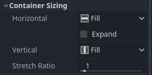
Sizing options are independent for vertical and horizontal sizing and not all containers make use of them (but most do):
Fill : Zajišťuje, že prvek vyplní určenou oblast v kontejneru. Bez ohledu na to, zda se ovládací prvek rozšiřuje - expands nebo ne (viz níže), vyplní pouze určenou oblast (ve výchozím stavu zapnuto).
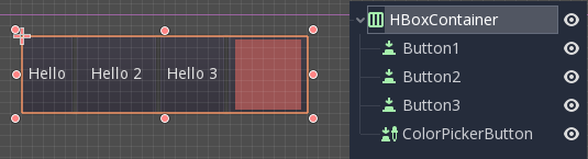
Expand: Attempts to use as much space as possible in the parent container (in each axis). Controls that don't expand will be pushed away by those that do. Between expanding controls, the amount of space they take from each other is determined by the Stretch Ratio (see below). This option is only available when the parent Container is of the right type, for example the HBoxContainer has this option for horizontal sizing.
Shrink Begin When expanding, try to remain at the left or top of the expanded area.
Shrink Center When expanding, try to remain at the center of the expanded area.
Shrink End When expanding, try to remain at the right or bottom of the expanded area.
Stretch Ratio: The ratio of how much expanded controls take up the available space in relation to each other. A control with "2", will take up twice as much available space as one with "1".
Doporučujeme experimentovat s těmito příznaky a různými kontejnery, abyste lépe pochopili, jak fungují.
Typy kontejnerů
Godot sám poskytuje několik typů kontejnerů pro různé účely:
Krabicové kontejnery
Arranges child controls vertically or horizontally (via HBoxContainer and VBoxContainer). In the opposite of the designated direction (as in, vertical for a horizontal container), it just expands the children.
These containers make use of the Stretch Ratio property for children with the Expand flag set.
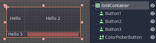
Mřížkový kontejner
Uspořádá podřízené ovládací prvky v rozvržení mřížky (prostřednictvím GridContainer, musí být zadáno množství sloupců). Používá příznaky vertikální i horizontální roztažení.
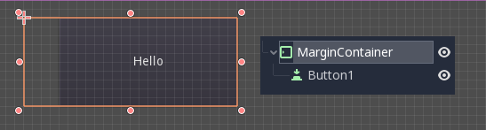
Kontejner pro okraje
Podřízené ovládací prvky jsou rozšířeny směrem k hranicím tohoto ovládacího prvku (prostřednictvím MarginContainer). Vnitřní okraje (padding) budou přidány v závislosti na konfiguraci motivu.
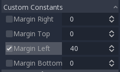
Opět mějte na paměti, že vnější okraje (margins) jsou hodnotou Theme, takže je třeba je upravovat v sekci potlačení konstant každého ovládacího prvku:
Karta (Tab) Kontejner
Umožňuje naskládat několik podřízených ovládacích prvků na sebe (pomocí TabContainer), přičemž je zobrazen pouze ten aktuální .
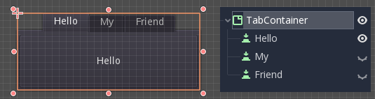
Změna aktuálního se provádí pomocí karet umístěných v horní části kontejneru kliknutím na:
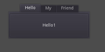
Názvy jsou ve výchozím nastavení generovány z názvů uzlů (i když je lze přepsat pomocí TabContainer API).
Nastavení, jako je umístění karet a StyleBox, lze změnit ve vlastnotech motivů pro TabContainer.
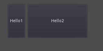
Rozdělovací kontejner
Arranges child controls vertically or horizontally and creates grabbers between them (via HSplitContainer and VSplitContainer). Respects both horizontal and vertical expand flags, as well as Stretch Ratio.
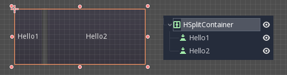
The grabbers can be dragged around to change the size relation between the children:
Panel kontejner
A container that draws a StyleBox, then expands children to cover its whole area (via PanelContainer, respecting the StyleBox margins). It respects both the horizontal and vertical sizing options.
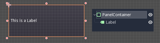
This container is useful as a top-level control, or just to add custom backgrounds to sections of a layout.
FoldableContainer
A container that can be expanded/collapsed (via FoldableContainer). Child controls are hidden when it is collapsed.
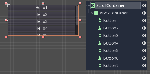
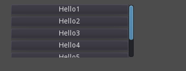
Kontejner pro scrolování
Accepts a single child node. If the child node is bigger than the container, scrollbars will be added to allow panning the node around (via ScrollContainer). Both vertical and horizontal size options are respected, and the behavior can be turned on or off per axis in the properties.
Kolečko myši a tažení dotykem (pokud je k dispozici dotyk) jsou také platné způsoby, jak posouvat podřízených prvkem.
Stejně jako ve výše uvedeném příkladě je jedním z nejčastějších způsobů použivání tohoto kontejneru společně podřízeným VBoxContainer kontejnerem.
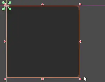
AspectRatioContainer
A container type that arranges its child controls in a way that preserves their proportions automatically when the container is resized. (via AspectRatioContainer). It has multiple stretch modes, providing options for adjusting the child controls' sizes concerning the container: "fill," "width control height," "height control width," and "cover."
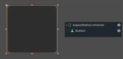
It is useful when you have a container that needs to be dynamic and responsive to different screen sizes, and you want the child elements to scale proportionally without losing their intended shapes.
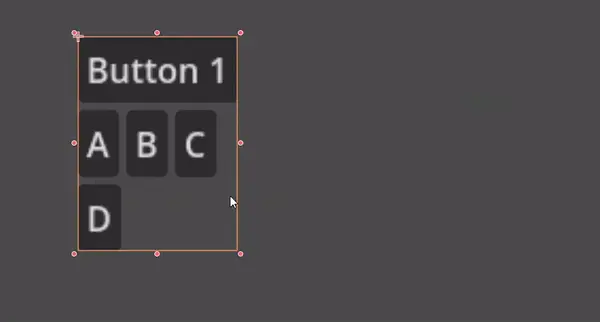
FlowContainer
FlowContainer is a container that arranges its child controls either horizontally or vertically (via HFlowContainer and via VFlowContainer). When the available space runs out, it wraps the children to the next line or column, similar to how text wraps in a book.
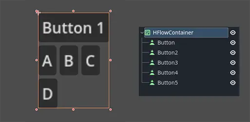
It is useful for creating flexible layouts where the child controls adjust automatically to the available space without overlapping.
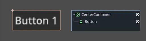
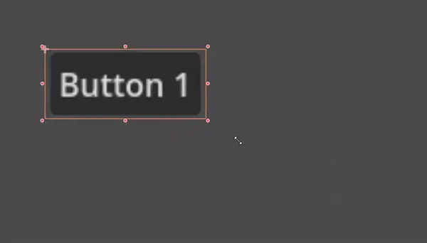
CenterContainer
CenterContainer is a container that automatically keeps all of its child controls centered within it at their minimum size. It ensures that the child controls are always aligned to the center, making it easier to create centered layouts without manual positioning (via CenterContainer).
SubViewportContainer
This is a special control that will only accept a single Viewport node as child, and it will display it as if it was an image (via SubViewportContainer).
Vytváření vlastních kontejnerů
It is possible to create a custom container using a script. Here is an example of a container that fits children to its size:
extends Container

func _notification(what):
    if what == NOTIFICATION_SORT_CHILDREN:
        # Must re-sort the children
        for c in get_children():
            # Fit to own size
            fit_child_in_rect(c, Rect2(Vector2(), size))

func set_some_setting():
    # Some setting changed, ask for children re-sort.
    queue_sort()
using Godot;

public partial class CustomContainer : Container
{
    public override void _Notification(int what)
    {
        if (what == NotificationSortChildren)
        {
            // Must re-sort the children
            foreach (Control c in GetChildren())
            {
                // Fit to own size
                FitChildInRect(c, new Rect2(new Vector2(), Size));
            }
        }
    }

    public void SetSomeSetting()
    {
        // Some setting changed, ask for children re-sort.
        QueueSort();
    }
}