Mehrere Auflösungen
Das Problem mit mehreren Auflösungen
Entwickler haben oft Probleme zu verstehen, wie sie mehrere Auflösungen in ihren Spielen am besten unterstützen können. Bei Desktop- und Konsolenspielen ist dies mehr oder weniger einfach, da die meisten Seitenverhältnisse auf dem Bildschirm 16: 9 betragen und die Auflösungen Standard sind (720p, 1080p, 1440p, 4K,…).
Für Handyspiele war es zunächst einfach. Das iPhone und das iPad verwendeten viele Jahre lang dieselbe Auflösung. Bei der Implementierung von Retina wurde die Pixeldichte nur verdoppelt. Die meisten Entwickler mussten nun Inhalte in Standard und doppelter Auflösung bereitstellen.
Heutzutage ist dies nicht mehr der Fall, da es viele verschiedene Bildschirmgrößen, Dichten und Seitenverhältnisse gibt. Auch unkonventionelle Größen wie Ultrawide-Displays werden immer beliebter.
Bei 3D Spielen besteht keine große Notwendigkeit, mehrere Auflösungen zu unterstützen (aus ästhetischer Sicht). Die 3D-Geometrie füllt den Bildschirm nur basierend auf dem Sichtfeld aus, ohne das Seitenverhältnis zu berücksichtigen. Der Hauptgrund, warum dies unterstützt werden soll, ist in diesem Fall aus Leistungsgründen (Ausführen mit niedrigerer Auflösung, um die Anzahl der Bilder pro Sekunde zu erhöhen).
Für 2D und Spiel-Benutzeroberflächen ist dies eine andere Sache, da Grafiken mit bestimmten Pixelgrößen in Software wie Photoshop, GIMP oder Krita erstellt werden muss.
Da sich Layouts, Seitenverhältnisse, Auflösungen und Pixeldichten so stark ändern können, ist es nicht mehr möglich, Benutzeroberflächen für jeden bestimmten Bildschirm zu entwerfen. Eine andere Methode muss verwendet werden.
Eine Größe für alle
Der gebräuchlichste Ansatz besteht darin, eine einzelne Basis -Auflösung zu verwenden und diese dann an alles andere anzupassen. Mit dieser Auflösung wird von den meisten Spielern erwartet, dass sie das Spiel spielen (aufgrund ihrer Hardware). Für Handys hat Google nützliche Statistiken online, genauso bietet Steam dies auch für Desktops <https://store.steampowered.com/hwsurvey/>_.
Steam zeigt beispielsweise, dass die häufigste primäre Anzeigeauflösung 1920 × 1080 ist. Daher ist es sinnvoll, ein Spiel für diese Auflösung zu entwickeln und dann die Skalierung für verschiedene Größen und Seitenverhältnisse durchzuführen.
Godot bietet verschiedene nützliche Werkzeuge, um dies einfach zu erledigen.
Siehe auch
You can see how Godot's support for multiple resolutions works in action using the Multiple Resolutions and Aspect Ratios demo project.
Basisgröße
Eine Basisgröße für das Fenster kann in den Projekteinstellungen unter Anzeige → Fenster angegeben werden.
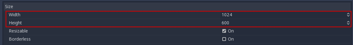
Was es tut, ist jedoch nicht ganz offensichtlich; Die Engine wird nicht versuchen, den Monitor auf diese Auflösung umzuschalten. Stellen Sie sich diese Einstellung vielmehr als "Entwurfsgröße" vor, d.h. als Größe des Bereichs, mit dem Sie im Editor arbeiten. Diese Einstellung entspricht direkt der Größe des blauen Rechtecks im 2D-Editor.
Es besteht häufig die Notwendigkeit, Geräte mit Bildschirm- und Fenstergrößen zu unterstützen, die sich von dieser Basisgröße unterscheiden. Godot bietet viele Möglichkeiten wie die Größe des Ansichtsfensters geändert und auf verschiedene Bildschirmgrößen ausgedehnt werden kann.
Bemerkung
Godot follows a modern approach to multiple resolutions. The engine will never change the monitor's resolution on its own. While changing the monitor's resolution is the most efficient approach, it's also the least reliable approach as it can leave the monitor stuck on a low resolution if the game crashes. This is especially common on macOS or Linux which don't handle resolution changes as well as Windows.
Changing the monitor's resolution also removes any control from the game developer over filtering and aspect ratio stretching, which can be important to ensure correct display for pixel art games.
On top of that, changing the monitor's resolution makes alt-tabbing in and out of a game much slower since the monitor has to change resolutions every time this is done.
Größenänderung
There are several types of devices, with several types of screens, which
in turn have different pixel density and resolutions. Handling all of
them can be a lot of work, so Godot tries to make the developer's life a
little easier. The Viewport
node has several functions to handle resizing, and the root node of the
scene tree is always a viewport (scenes loaded are instanced as a child
of it, and it can always be accessed by calling
get_tree().get_root() or get_node("/root")).
In jedem Fall ist das Ändern der Wurzel-Viewport-Parameter wahrscheinlich die flexibelste Methode um das Problem zu lösen. Es kann jedoch viel Arbeit, Code und Raten bedeuten. Daher bietet Godot in den Projekteinstellungen einen einfachen Parametersatz, um mehrere Auflösungen zu verarbeiten .
Dehnungs-Einstellungen
Die Dehnungseinstellungen befinden sich in den Projekteinstellungen und bieten verschiedene Optionen:

Streckungsmodus
Die Einstellung Dehnungsmodus definiert, wie die Basisgröße gedehnt wird, um der Auflösung des Fensters oder Bildschirms zu entsprechen.
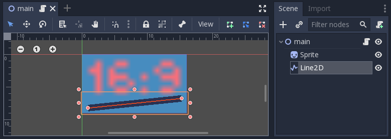
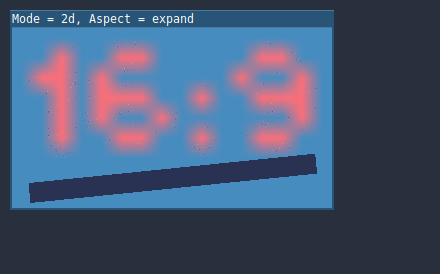
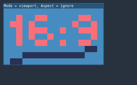
The animations below use a "base size" of just 16×9 pixels to demonstrate the effect of different stretch modes. A single sprite, also 16×9 pixels in size, covers the entire viewport, and a diagonal Line2D is added on top of it:
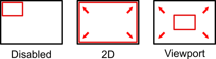
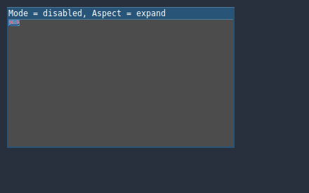
Stretch Mode = Disabled (default): No stretching happens. One unit in the scene corresponds to one pixel on the screen. In this mode, the Stretch Aspect setting has no effect.
Stretch Mode = 2D: In this mode, the base size specified in width and height in the project settings is stretched to cover the whole screen (taking the Stretch Aspect setting into account). This means that everything is rendered directly at the target resolution. 3D is unaffected, while in 2D, there is no longer a 1:1 correspondence between sprite pixels and screen pixels, which may result in scaling artifacts.
Stretch Mode = Viewport: Viewport scaling means that the size of the root Viewport is set precisely to the base size specified in the Project Settings' Display section. The scene is rendered to this viewport first. Finally, this viewport is scaled to fit the screen (taking the Stretch Aspect setting into account).

Dehnungsaspekt
The second setting is the stretch aspect. Note that this only takes effect if Stretch Mode is set to something other than Disabled.
In the animations below, you will notice gray and black areas. The black areas are added by the engine and cannot be drawn into. The gray areas are part of your scene, and can be drawn to. The gray areas correspond to the region outside the blue frame you see in the 2D editor.
Stretch Aspect = Ignore: Ignore the aspect ratio when stretching the screen. This means that the original resolution will be stretched to exactly fill the screen, even if it's wider or narrower. This may result in nonuniform stretching: things looking wider or taller than designed.
Stretch Aspect = Keep: Keep aspect ratio when stretching the screen. This means that the viewport retains its original size regardless of the screen resolution, and black bars will be added to the top/bottom of the screen ("letterboxing") or the sides ("pillarboxing").
This is a good option if you know the aspect ratio of your target devices in advance, or if you don't want to handle different aspect ratios.

Stretch Aspect = Keep Width: Keep aspect ratio when stretching the screen. If the screen is wider than the base size, black bars are added at the left and right (pillarboxing). But if the screen is taller than the base resolution, the viewport will be grown in the vertical direction (and more content will be visible to the bottom). You can also think of this as "Expand Vertically".
Dies ist normalerweise die beste Option zum Erstellen von skalierbaren GUIs oder HUDs, sodass einige Steuerelemente unten verankert werden können (Größe und Bezugspunkte (Anker)).

Stretch Aspect = Keep Height: Keep aspect ratio when stretching the screen. If the screen is taller than the base size, black bars are added at the top and bottom (letterboxing). But if the screen is wider than the base resolution, the viewport will be grown in the horizontal direction (and more content will be visible to the right). You can also think of this as "Expand Horizontally".
This is usually the best option for 2D games that scroll horizontally (like runners or platformers).

Stretch Aspect = Expand: Keep aspect ratio when stretching the screen, but keep neither the base width nor height. Depending on the screen aspect ratio, the viewport will either be larger in the horizontal direction (if the screen is wider than the base size) or in the vertical direction (if the screen is taller than the original size).
Tipp
To support both portrait and landscape mode with a similar automatically determined scale factor, set your project's base resolution to be a square (1:1 aspect ratio) instead of a rectangle. For instance, if you wish to design for 1280×720 as the base resolution but wish to support both portrait and landscape mode, use 720×720 as the project's base window size in the Project Settings.
To allow the user to choose their preferred screen orientation at run-time,
remember to set Display > Window > Handheld > Orientation to sensor.
Strecken-Stauchen
The Shrink setting allows you to add an extra scaling factor on top of what the Stretch options above already provide. The default value of 1 means that no scaling occurs.
If, for example, you set Shrink to 4 and leave Stretch Mode on Disabled, each unit in your scene will correspond to 4×4 pixels on the screen.
If Stretch Mode is set to something other than Disabled, the size of the root viewport is scaled down by the Shrink factor, and pixels in the output are scaled up by the same amount. This is rarely useful for 2D games, but can be used to increase performance in 3D games by rendering them at a lower resolution.
aus Skripten
To configure stretching at runtime from a script, use the
get_tree().set_screen_stretch() method (see
SceneTree.set_screen_stretch()).
Häufige Anwendungsszenarien
Die folgenden Einstellungen werden empfohlen für eine optimale Unterstützung unterschiedlicher Bildschirmauflösungen und Seitenverhältnissen.
Desktop-Spiel
Non-Pixel Art:
Set the base window width to
1920and window height to1080. If you have a display smaller than 1920×1080, set Test Width and Test Height to lower values to make the window smaller when the project starts.Alternatively, if you're targeting high-end devices primarily, set the base window width to
3840and window height to2160. This allows you to provide higher resolution 2D assets, resulting in crisper visuals at the cost of higher memory usage and file sizes. Note that this will make non-mipmapped textures grainy on low resolution devices, so make sure to follow the instructions described in Aliasing beim Downsampling reduzieren.Setzen Sie den Streckmodus auf
2d.Set the stretch aspect to
expand. This allows for supporting multiple aspect ratios and makes better use of tall smartphone displays (such as 18:9 or 19:9 aspect ratios).Configure Control nodes' anchors to snap to the correct corners using the Layout menu.
Pixel art:
Set the base window size to the viewport size you intend to use. Most pixel art games use viewport sizes between 256×224 and 640×480. Higher viewport sizes will require using higher resolution artwork, unless you intend to show more of the game world at a given time.
Set the stretch mode to
viewport.Set the stretch aspect to
keepto enforce a single aspect ratio (with black bars). As an alternative, you can set the stretch aspect toexpandto support multiple aspect ratios.If using the
expandstretch aspect, Configure Control nodes' anchors to snap to the correct corners using the Layout menu.
Bemerkung
The viewport stretch mode provides low-resolution rendering that is then
stretched to the final window size. If you are OK with sprites being able to
move or rotate in "sub-pixel" positions or wish to have a high resolution 3D
viewport, you should use the 2d stretch mode instead of the viewport
stretch mode.
Godot currently doesn't have a way to enforce integer scaling when using the
2d or viewport stretch mode, which means pixel art may look bad if the
final window size is not a multiple of the base window size.
To fix this, use an add-on such as the Integer Resolution Handler.
Handyspiel im Querformat
Godot is configured to use landscape mode by default. This means you don't need to change the display orientation project setting.
Set the base window width to
1280and window height to720.Alternatively, if you're targeting high-end devices primarily, set the base window width to
1920and window height to1080. This allows you to provide higher resolution 2D assets, resulting in crisper visuals at the cost of higher memory usage and file sizes. Many devices have even higher resolution displays (1440p), but the difference with 1080p is barely visible given the small size of smartphone displays. Note that this will make non-mipmapped textures grainy on low resolution devices, so make sure to follow the instructions described in Aliasing beim Downsampling reduzieren.Setzen Sie den Streckmodus auf
2d.Set the stretch aspect to
expand. This allows for supporting multiple aspect ratios and makes better use of tall smartphone displays (such as 18:9 or 19:9 aspect ratios).Configure Control nodes' anchors to snap to the correct corners using the Layout menu.
Handyspiel im Hochformat
Set the base window width to
720and window height to1080.Alternatively, if you're targeting high-end devices primarily, set the base window width to
1080and window height to1920. This allows you to provide higher resolution 2D assets, resulting in crisper visuals at the cost of higher memory usage and file sizes. Many devices have even higher resolution displays (1440p), but the difference with 1080p is barely visible given the small size of smartphone displays. Note that this will make non-mipmapped textures grainy on low resolution devices, so make sure to follow the instructions described in Aliasing beim Downsampling reduzieren.Set Display > Window > Handheld > Orientation to
portrait.Setzen Sie den Streckmodus auf
2d.Set the stretch aspect to
expand. This allows for supporting multiple aspect ratios and makes better use of tall smartphone displays (such as 18:9 or 19:9 aspect ratios).Configure Control nodes' anchors to snap to the correct corners using the Layout menu.
Non-game application
Set the base window width and height to the smallest window size that you intend to target. This is not required, but this ensures that you design your UI with small window sizes in mind.
Lassen Sie den Streckungsmodus auf seinem Standardwert,
deaktiviert.Keep the stretch aspect to its default value,
ignore(its value won't be used since the stretch mode isdisabled).You can define a minimum window size by setting
OS.min_window_sizein a script's_ready()function. This prevents the user from resizing the application below a certain size, which could break the UI layout.
Bemerkung
Godot doesn't support manually overriding the 2D scale factor yet, so it is not possible to have hiDPI support in non-game applications. Due to this, it is recommended to leave Allow Hidpi disabled in non-game applications to allow for the OS to use its low-DPI fallback.
hiDPI support
By default, Godot projects aren't considered DPI-aware by the operating system.
This is done to improve performance on low-end systems, since the operating
system's DPI fallback scaling will be faster than letting the application scale
itself (even when using the viewport stretch mode).
However, the OS-provided DPI fallback scaling doesn't play well with fullscreen mode. If you want crisp visuals on hiDPI displays or if project uses fullscreen, it's recommended to enable Display > Window > Dpi > Allow Hidpi in the Project Settings.
Allow Hidpi is only effective on Windows and macOS. It's ignored on all other platforms.
Bemerkung
The Godot editor itself is always marked as DPI-aware. Running the project from the editor will only be DPI-aware if Allow Hidpi is enabled in the Project Settings.
Aliasing beim Downsampling reduzieren
If the game has a very high base resolution (e.g. 3840×2160), aliasing might appear when downsampling to something considerably lower like 1280×720. Aliasing can be made less visible by shrinking all images by a factor of 2 upon loading. This can be done by calling the method below before the game data is loaded:
VisualServer.texture_set_shrink_all_x2_on_set_data(true)
Alternatively, you can also enable mipmaps on all your 2D textures. However, enabling mipmaps will increase memory usage which may be problematic on low-end mobile devices.
Umgang mit Seitenverhältnissen
Once scaling for different resolutions is accounted for, make sure that your user interface also scales for different aspect ratios. This can be done using anchors and/or containers.
Skalierung des Sichtfelds
The 3D Camera node's Keep Aspect property defaults to the Keep Height scaling mode (also called Hor+). This is usually the best value for desktop games and mobile games in landscape mode, as widescreen displays will automatically use a wider field of view.
However, if your 3D game is intended to be played in portrait mode, it may make more sense to use Keep Width instead (also called Vert-). This way, smartphones with an aspect ratio taller than 16:9 (e.g. 19:9) will use a taller field of view, which is more logical here.
Skalieren von 2D und 3D Elementen in Ansichtsfenstern
Wenn Sie mehrere Ansichtsfenster-Nodes verwenden, können Sie für verschiedene Elemente unterschiedliche Maßstäbe festlegen. Sie können dies beispielsweise verwenden, um die 3D Welt mit einer niedrigen Auflösung zu rendern und gleichzeitig die native Auflösung von 2D Elementen beizubehalten. Dies kann die Leistung erheblich verbessern, während das HUD und andere 2D Elemente scharf bleiben.
Dazu wird der Wurzel-Viewport-Node nur für 2D-Elemente verwendet. Anschließend wird ein Viewport-Node zum Anzeigen der 3D Welt erstellt und mithilfe eines ViewportContainer oder TextureRect-Nodes angezeigt. Das endgültige Projekt wird effektiv zwei Viewports enthalten. Ein Vorteil der Verwendung von TextureRect über ViewportContainer besteht darin, dass die lineare Filterung aktiviert werden kann. Dadurch sehen skalierte 3D Ansichtsfenster in vielen Fällen besser aus.
Beispiele finden Sie unter 3D-Ansichtsfenstern Skalierungs-Demo.