Design the GUI
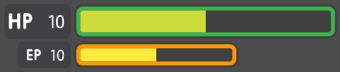
Now that you’ve nailed the basics, we’re going to see how to build a game Graphical User Interface (GUI) with reusable UI components: a life bar, an energy bar, and bomb and emerald counters. By the end of this tutorial, you’ll have a game GUI, ready to control with GDscript or VisualScript:
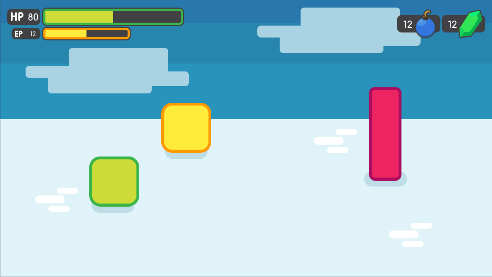
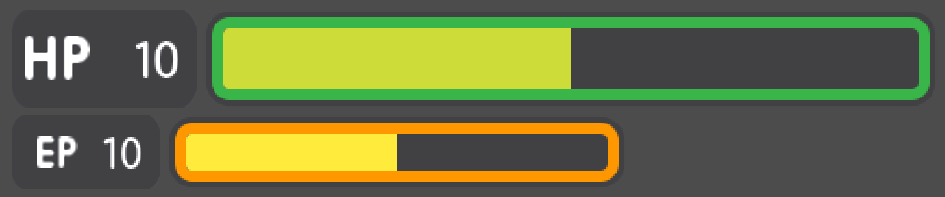
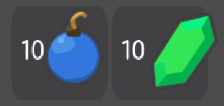
The final result
You’ll also learn to:
- Create flexible UI components
- Use scene inheritance
- Build a complex UI
Download the project files: ui_gui_design.zip and extract the archive. Import the start/ project in Godot to follow this tutorial. The end/ folder contains the final result.
Note
You can watch this tutorial as a video on Youtube.
Breaking down the UI
Let’s break down the final UI and plan the containers we’ll use. As in
the Design a title screen, it starts with a MarginContainer.
Then, we can see up to three columns:
- The life and energy counters on the left
- The life and energy bars
- The bomb and emerald counters on the right
But the bar’s label and the gauge are two parts of the same UI element. If we think of them this way, we’re left with two columns:
- The life and energy bars on the left
- The bomb and emerald counters on the right
This makes it easier to nest containers: we have some margins around the
border of the screen using a MarginContainer, followed by an
HBoxContainer to manage our two columns. The two bars stack on top
of one another inside a VBoxContainer. And we’ll need a last
HBoxContainer in the right column to place the bomb and emerald
counters side-by-side.
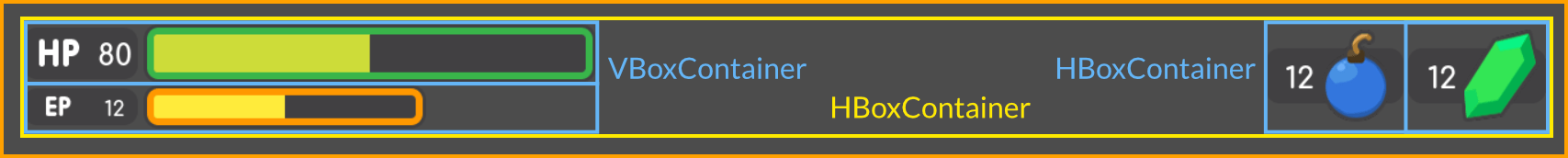
We get a clean UI layout with only 4 containers
We will need extra containers inside the individual UI components, but this gives us the main GUI scene’s structure. With this plan in place, we can jump into Godot and create our GUI.
Create the base GUI
There are two possible approaches to the GUI: we can design elements in separate scenes and put them together, or prototype everything in a single scene and break it down later. I recommend working with a single scene as you can play with your UI’s placement and proportions faster this way. Once it looks good, you can save entire sections of the node tree as reusable sub-scenes. We’ll do that in a moment.
For now, let’s start with a few containers.
Create a new scene and add a MarginContainer. Select the node and name it
GUI.
We want our interface to anchor to the top of the screen. Select the GUI
node and click the Layout button at the top of the viewport. Select the Top
Wide option. The GUI node will anchor to the top edge of its parent, the
viewport by default. It will resize automatically on the vertical axis to make
space for its child UI components.
Save the scene as GUI.tscn. We will put the entire GUI in it.
With the MarginContainer selected, head to the inspector and scroll
down to the custom constants section. Unfold it and click the field next
to each of the Margin properties. Set them all to 20 pixels.
Next, add an HBoxContainer node. This one will contain our two bars
on the left and separate them from the two counters on the right.
We want to stack the bars vertically inside the HBoxContainer.
Add a VBoxContainer as a child of HBoxContainer and name it Bars. Select the parent
HBoxContainer again and this time, add another HBoxContainer as a child of it.
Call it Counters. With these four containers, we have the base for our GUI scene.
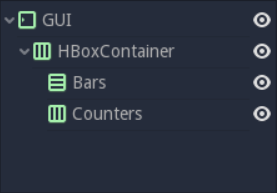
You should have 4 containers that look like this
Note
We can work this way because we first broke down our UI design and took a few moments to think about the containers we’d use. When you follow a tutorial like this, it may seem weird. But once you’re working on real games, you’ll see it’s an efficient workflow.
Create the bars’ base
Each bar is split into two sub-elements that align horizontally: the
label with the health count on the left, and the gauge on the right.
Once again, the HBoxContainer is the perfect tool for the job.
Select the Bars node and add a new HBoxContainer inside of it.
Name it Bar.
The label itself requires at least three nodes: a NinePatchRect
for the background, on top of which we’ll add a texture on the left,
either HP or EP, and a Label on the right for the value. We
can nest Control nodes however we want. We could use the
NinePatchRect as a parent for the two other elements, as it
encompasses them. In general, you want to use containers instead, as
their role is to help organize UI components. We’ll need a
MarginContainer later anyway to add some space between the life
count and the gauge. Select the Bar and add a MarginContainer.
Name it Count. Inside of it, add three nodes:
- A
NinePatchRectnamedBackground - A
TextureRectnamedTitle - And a
LabelnamedNumber
To add the nodes as siblings, always select the Count node first.
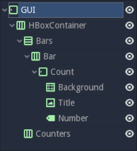
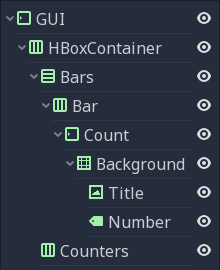
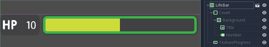
Your scene tree should look like this. We’re ready to throw in some textures
Our scene is still empty. It’s time to throw in some textures. To load the textures, head to the FileSystem dock to the left of the viewport. Browse down to the res://assets/GUI folder.
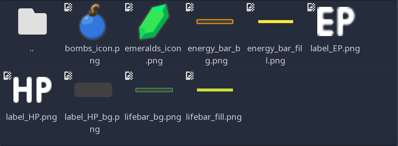
You should see a list of textures that we’ll use to skin our interface.
Select the Background in the Scene dock. In the Inspector, you
should see a Texture property. In the FileSystem tab, click and drag
label_HP_bg.png onto the Texture slot. It stays squashed. The
parent MarginContainer will force its size down to 0 until we force
elements inside the container to have a minimum size. Select the
Background node. In the Inspector, scroll down to the Rect section.
Set Min Size to (100, 40). You should see the Background resize
along with its parent containers.
Next, select the Title and drag and drop label_HP.png into its
Texture slot. Select the Number node, click the field next to
the Text property and type 10. This way, we can see both nodes
in the viewport. They should stack up in the top-left corner of their
parent MarginContainer.
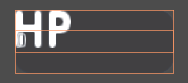
If you select both nodes, you should see something like this
As they have a container as their direct parent, we cannot move them
freely: the Count node will always reset their anchors, their size
and position. Try to move and resize the nodes in the viewport. Then,
select any of the three textures and press Ctrl Up or Ctrl Down to
reorder them in the Scene dock. They’ll snap back to their previous size
and position.
Parent containers control the size, the scale, the margins, and the
anchors of their direct children. To modify the nodes, you must nest
them inside a regular Control or another UI element. We’ll use the
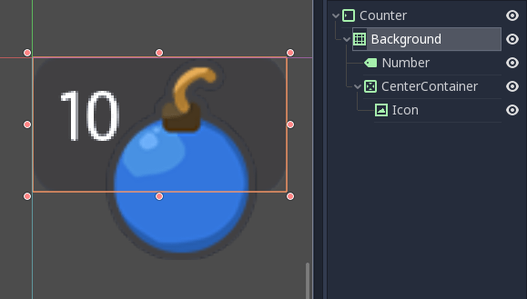
Background as a parent for the Title and Number. Select both
the Title and Number, and drag and drop them onto
Background.
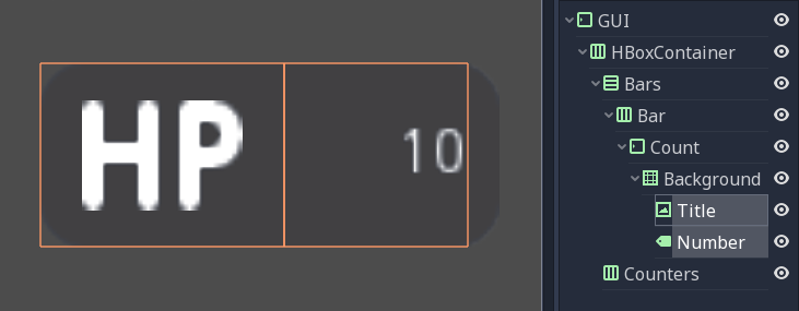
By using the Background node as the two textures’ parent, we take control away from the Count MarginContainer
Select the Title and in the Inspector, change its Stretch Mode property
to Keep Centered. Next find the Rect category in the Inspector and
change the Size property to (50, 40) so it only takes the left half of
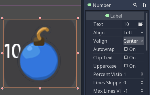
the background. Next, select the Number node. In the viewport, click the
Layout menu and click Full Rect. The node will resize to fit
the Background. Head to the Inspector and change its Align
property to Right, and the VAlign property to Center. The
text should snap to the center of the Background’s right edge.
Resize the node horizontally, so it takes the right half of the
Background and there’s a bit of padding with the right edge.
Here’s how the nodes’ bounding boxes should look in the viewport. Keep it rough, you don’t need to place them too precisely for now.
Replace the Label’s font
The label’s font is too small. We need to replace it. Select the
Number node and in the Inspector, scroll down to the Control
class, and find the Custom Font category. Click the field next to
the Font property and click on New Dynamic Font. Click on the
field again and select Edit.
You will enter the Dynamic Font resource. Unfold the Font
category and click the field next to Font Data. Click the Load
button. In the file browser, navigate down to the assets/font folder and
double click Comfortaa-Bold.ttf to open it. You should see the font
update in the viewport. Unfold the settings category to change the font
size. Set the Size property to a higher value, like 24 or
28.
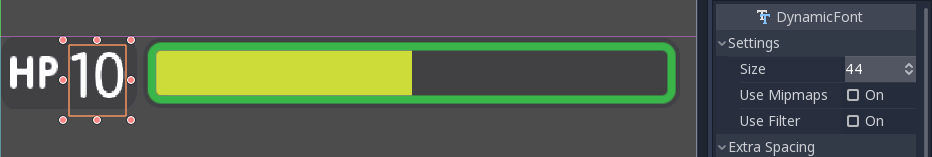
We now need the text’s baseline, the number’s lower edge, to align with
the HP texture on the left. To do so, still in the DynamicFont
resource, you can tweak the Bottom property under the
Extra Spacing category. It adds some bottom padding to the text.
Click the Number node in the Scene tab to go back to the node’s
properties and change the VAlign to Bottom. To adjust the text’s
baseline, click on the font field under the Custom Font category
again and tweak the Bottom property until the text aligns with the
Title node. I used a value of 2 pixels.
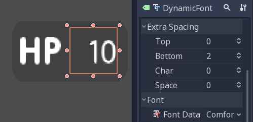
With a Bottom value of 2 pixels, the Number aligns with the Title
With this, we finished the hardest part of the GUI. Congratulations! Let’s move on to the simpler nodes.
Add the progress bar
We need one last element to complete our life bar: the gauge itself.
Godot ships with a TextureProgress node that has everything we need.
Select the Bar node and add a TextureProgress inside of it. Name it
Gauge. In the inspector unfold the Textures section. Head to the
FileSystem dock and drag and drop the lifebar_bg.png texture onto
the Under slot. Do the same with the lifebar_fill.png image and
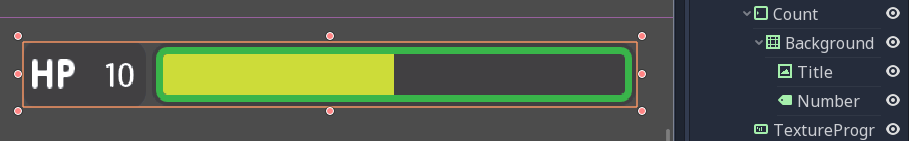
drop it onto the Progress slot. Under the Range class in the
inspector, change the Value property to 50 to see the gauge fill
up.
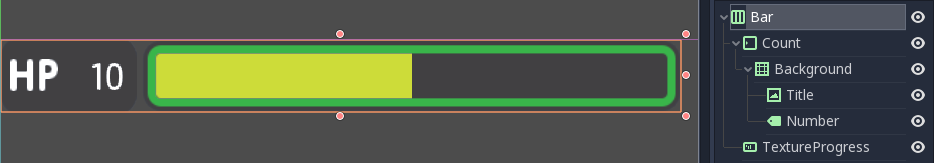
With only five Control nodes, our first bar is ready to use.
That’s it, our life bar is ready. This last part was quick, wasn’t it? That’s thanks to our robust container setup.
Design the bomb and emerald counters
The bomb and emerald counters are like the bar’s Count node. So we’ll
duplicate it and use it as a template.
Under the Bar node, select Count and press Ctrl D to duplicate
it. Drag and drop the new node under the Counters HBoxContainer
at the bottom of the scene tree. You should see it resize automatically.
Don’t worry about this for now, we’ll fix the size soon.
Rename the Count2 node to Counter. Unlike the bars, we want the
number to be on the left, and an icon to sit on the right. The setup is
the same: we need a background (a NinePatchRect), the title, and the
number nodes. The Title node is a TextureRect, so it’s what we
need to display the icon. In the scene tree, select the Title node,
and rename it to Icon.
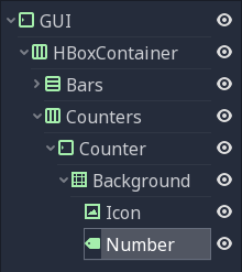
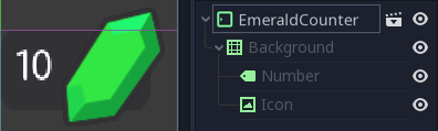
Here’s how your node tree should look so far
With the Icon node selected, in the inspector, scroll to the top to
see the Texture slot. Head to the FileSystem dock on the left and
select the bombs_icon.png. Drag and drop it onto the Texture
slot. In the Scene Tab select both the Icon and the Number
nodes. Click the Layout menu in the toolbar at the top of the viewport
and select Full Rect. Both nodes will update to fit
the size of the Background.
The nodes anchor to the entire Background, but their position is off
Let’s change the Number’s align properties to move it to the left
and center of the Background. Select the Number node, change its
Align property to left and the VAlign property to centre. Then
resize its left edge a little bit to add some padding between the left
edge of the Background and the text.
The Number node aligned to the left and centre
To overlap the Icon and the background, we need a few tweaks. First, our background is a bit too tall. It’s because it’s inside a margin container that is controlled by the top-most GUI node. Select the GUI node at the top of the scene tree and downsize it vertically so that it’s as thin as possible. You’ll see the gauge prevents you from making it too small. A container cannot be smaller than the minimal size of its children. The container’s margins also weigh in.
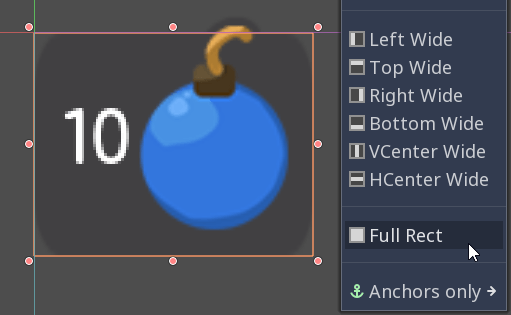
Select the Icon, click the Layout menu, and select
Full Rect to re-center it. We need it to anchor to
the Background’s right edge. Open the Layout menu again and select
Center Right. Move the icon up so it is centered vertically with the
Background.
The bomb icon anchors to the Background’s right edge. Resize the Counter container to see the Icon node stick to its right side
Because we duplicated the Counter from the bar’s Count, the
Number node’s font is off. Select the Number node again, head to
the Font property, and click it to access the DynamicFont
resource. In the Extra Spacing section, change the Bottom value
to 0 to reset the font’s baseline. Our counter now works as
expected.
Let’s make the Counters anchor to the right edge of the viewport. To do so,
we need to set the Bars container take all the available horizontal space it
can. Select the Bars node and scroll down to the Size Flags category. In
the Horizontal category, check the Expand value. The Bars node
should resize and push the counter to the right side of the screen.

An expanding container eats all the space it can from its parent, pushing everything else along the way
Turn the bar and counter into reusable UI components
We have one bar and one counter widget. But we need two of each. We may need to change the bars’ design or their functionality later on. It’d be great if we could have a single scene to store a UI element’s template, and child scenes to work on variations. Godot lets us do this with Inherited Scenes.
Let’s save both the Counter and the Bar branches as separate
scenes that we’ll reduce to create the LifeBar, the EnergyBar,
the BombCounter, and the EmeraldCounter. Select the Bar
HBoxContainer. Right click on it and click on Save Branch as Scene.
Save the scene as Bar.tscn. You should see the node branch turn it
to a single Bar node.
Tip
A scene is a tree of nodes. The topmost node is the tree’s
root, and the children at the bottom of the hierarchy are
leaves. Any node other than the root along with one or more children is
a branch. We can encapsulate node branches into separate scenes, or
load and merge them from other scenes into the active one. Right click
on any node in the Scene dock and select Save Branch as Scene or
Merge from Scene.
Then, select the Counter node and do the same. Right click,
Save Branch as Scene, and save it as Counter.tscn. A new edit
scene icon appears to the right of the nodes in the scene tree. Click on
the one next to Bar to open the corresponding scene. Resize the
Bar node so that its bounding box fits its content. The way we named
and placed the Control nodes, we’re ready to inherit this template and
create the life bar. It’s the same for the Counter.
With no extra changes, our Bar is ready to use
Use scene inheritance to create the remaining elements
We need two bars that work the same way: they should feature a label on the left, with some value, and a horizontal gauge on the right. The only difference is that one has the HP label and is green, while the other is called EP and is yellow. Godot gives us a powerful tool to create a common base to reuse for all bars in the game: inherited scenes.
Inherited scenes help us keep the GUI scene clean. In the end, we will only have containers and one node for each UI component.
On an inherited scene, you can change any property of every node in the inspector, aside from its name. If you modify and save the parent scene, all the inherited scenes update to reflect the changes. If you change a value in the inherited scene, it will always override the parent’s property. It’s useful for UIs, as they often require variations of the same elements. In general, in UI design, buttons, panels etc. share a common base style and interactions. We don’t want to copy it over to all variations manually.
A reload icon will appear next to the properties you override. Click it to reset the value to the parent scene’s default.
Note
Think of scene inheritance like the node tree, or the
extends keyword in GDScript. An inherited scene does everything like
its parent, but you can override properties, resources and add extra
nodes and scripts to extend its functionality.
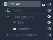
Inherit the Bar Scene to build the LifeBar
Go to Scene -> New Inherited Scene to create a new type of Bar.
Select the Bar scene and open it. You should see a new [unsaved] tab,
that’s like your Bar, but with all nodes except the root in grey.
Press Meta+S to save the new inherited scene and name it
LifeBar.
You can’t rename grey nodes. This tells you they have a parent scene
First, rename the root or top level node to LifeBar. We always want
the root to describe exactly what this UI component is. The name
differentiates this bar from the EnergyBar we’ll create next. The
other nodes inside the scene should describe the component’s structure
with broad terms, so it works with all inherited scenes. Like our
TextureProgress and Number nodes.
Note
If you’ve ever done web design, it’s the same spirit as working with CSS: you create a base class, and add variations with modifier classes. From a base button class, you’ll have button-green and button-red variations for the user to accept and refuse prompts. The new class contains the name of the parent element and an extra keyword to explain how it modifies it. When we create an inherited scene and change the name of the top level node, we’re doing the same thing.
Design the EnergyBar
We already setup the LifeBar’s design with the main Bar scene.
Now we need the EnergyBar.
Let’s create a new inherited scene, and once again select the
Bar.tscn scene and open it. Double-click on the Bar root node and rename it
to EnergyBar. Save the new scene as EnergyBar.tscn.
We need to replace the HP texture with EP one, and to
change the textures on the gauge.
Head to the FileSystem dock on the left, select the Title node in
the Scene tree and drag and drop the label_EP.png file onto the
texture slot. Select the Number node and change the Text
property to a different value like 14.
You’ll notice the EP texture is smaller than the HP one. We should
update the Number’s font size to better fit it. A font is a
resource. All the nodes in the entire project that use this resource
will be affected by any property we change. You can try to change the
size to a huge value like 40 and switch back to the LifeBar or
the Bar scenes. You will see the text increased in size.
If we change the font resource, all the nodes that use it are affected
To change the font size on this node only, we must create a copy of the
font resource. Select the Number node again and click on the wrench
and screwdriver icon on the top right of the inspector. In the drop-down
menu, select the Make Sub-Resources Unique option. Godot will find
all the resources this node uses and create unique copies for us.
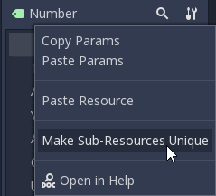
Use this option to create unique copies of the resources for one node
Tip
When you duplicate a node from the Scene tree, with
Meta+D, it shares its resources with the original node. You
need to use Make Sub-Resources Unique before you can tweak the
resources without affecting the source node.
Scroll down to the Custom Font section and open Font. Lower the
Size to a smaller value like 20 or 22. You may also need to
adjust the Bottom spacing value to align the text’s baseline with
the EP label on the left.

The EP Count widget, with a smaller font than its HP counterpart
Now, select the TextureProgress node. Drag the energy_bar_bg.png
file onto the Under slot and do the same for energy_bar_fill.png
and drop it onto the Progress texture slot.
You can resize the node vertically so that its bounding rectangle fits
the gauge. Do the same with the Count node until its size aligns
with that of the bar. Because the minimal size of TextureProgress is
set based on its textures, you won’t be able to downsize the Count
node below that. That is also the size the Bar container will have.
You may downscale this one as well.
Last but not least, the Background container has a minimum size that
makes it a bit large. Select it and in the Rect section, change the
Min Size property down to 80 pixels. It should resize
automatically and the Title and Number nodes should reposition
as well.

The Count looks better now it’s a bit smaller
Tip
The Count node’s size affects the position of the TextureProgress. As we’ll align our bars vertically in a moment, we’re better off using the Counter’s left margin to resize our EP label. This way both the EnergyBar’s Count and the LifeBar’s Count nodes are one hundred pixels wide, so both gauges will align perfectly.
Prepare the bomb and emerald counters
Let us now take care of the counters. Go to
Scene -> New Inherited Scene and select the Counter.tscn as a
base. Rename the root node as BombCounter too.
Save the new scene as BombCounter.tscn. That’s all for this scene.
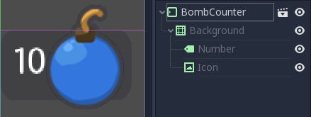
The bomb counter is the same as the original Counter scene
Go to Scene -> New Inherited Scene again and select Counter.tscn
once more. Rename the root node EmeraldCounter and save the scene as EmeraldCounter.tscn.
For this one, we mainly need to replace the bomb icon
with the emerald icon. In the FileSystem tab, drag the emeralds_icon.png
onto the Icon node’s Texture slot. Icon already anchors to
the right edge of the Background node so we can change its position
and it will scale and reposition with the EmeraldCounter container.
Shift the emerald icon a little bit to the right and down. Use the Arrow
Keys on the keyboard to nudge its position. Save, and we’re done with
all the UI elements.
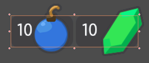
The emerald counter should look something like this
Add the UI components to the final GUI
Time to add all the UI elements to the main GUI scene. Open the
GUI.tscn scene again, and delete the Bar and Counter nodes.
In the FileSystem dock, find the LifeBar.tscn and drag and drop it
onto the Bars container in the scene tree. Do the same for the
EnergyBar. You should see them align vertically.
The LifeBar and the EnergyBar align automatically
Now, drag and drop the BombCounter.tscn and EmeraldCounter.tscn scenes onto the
Counters node. They’ll resize automatically.
The nodes resize to take all the available vertical space
To let the EmeraldCounter and BombCounter use the size we defined
in Counter.tscn, we need to change the Size Flags on the
Counters container. Select the Counters node and unfold the
Size Flags section in the Inspector. Uncheck the Fill tag for
the Vertical property, and check Shrink Center so the container
centers inside the HBoxContainer.
Now both counters have a decent size
Tip
Change the Min Size property of the Counters container
to control the height of the counters’ background.
We have one small issue left with the EP label on the EnergyBar: the 2
bars should align vertically. Click the icon next to the EnergyBar
node to open its scene. Select the Count node and scroll down to the
Custom Constants section. Add a Margin Left of 20. In
the Rect section set the node’s Min Size back to 100, the same
value as on the LifeBar. The Count should now have some margin on
the left. If you save and go back to the GUI scene, it will be aligned
vertically with the LifeBar.
The 2 bars align perfectly
Note
We could have set up the EnergyBar this way a few moments
ago. But this shows you that you can go back to any scene anytime, tweak
it, and see the changes propagate through the project!
Place the GUI onto the game’s mockup
To wrap up the tutorial we’re going to insert the GUI onto the game’s mockup scene.
Head to the FileSystem dock and open LevelMockup.tscn.
Drag-and-drop the GUI.tscn scene right below the bg node and
above the Characters. The GUI will scale to fit the entire viewport.
Head to the Layout menu and select the Center Top option so it anchors
to the top edge of the game window. Then resize the GUI to make it as
small as possible vertically. Now you can see how the interface looks in
the context of the game.
Congratulations for getting to the end of this long tutorial. You can
find the final project here: ui_gui_design.zip.
The final result
Note
A final note about Responsive Design. If you resize the GUI, you’ll see the nodes move, but the textures and text won’t scale. The GUI also has a minimum size, based on the textures inside of it. In games, we don’t need the interface to be as flexible as that of a website. You almost never want to support both landscape and portrait screen orientations. It’s one or the other. In landscape orientation, the most common ratios range from 4:3 to 16:9. They are close to one another. That’s why it’s enough for the GUI elements to only move horizontally when we change the window size.