Attention: Here be dragons
This is the latest
(unstable) version of this documentation, which may document features
not available in or compatible with released stable versions of Godot.
Checking the stable version of the documentation...
コンテナの使用
アンカー は、GUIでの基本的な複数解像度処理に対して異なるアスペクト比を処理する効率的な方法です。
より複雑なユーザーインターフェイスの場合、使いにくい可能性があります。
これは、RPG、オンラインチャット、経営/戦略シミュレーションなどのゲームによく見られます。高度なレイアウト機能が必要になる可能性があるもう 1つの一般的なケースは、ゲーム内ツール(または単にツール)です。
このような状況では、高度なレイアウトと書式設定を備えた、より高い機能を持つOSのようなユーザー インターフェイスが必要です。そのためには、Containers の方が便利です。
コンテナのレイアウト
コンテナは、膨大な量のレイアウト機能を提供します(例として、Godotエディタのユーザーインターフェイスはそれを使って完全に仕上がっています):
Container 派生ノードを使用すると、すべての子 Control ノードは独自のポジショニング機能を放棄します。つまり、これらのノードを手動で変更しようとしても、コンテナ がその位置を制御しているので、次に親がサイズ変更されたときに変更が無視または無効化されることを意味します。
同様に、コンテナ 派生ノードのサイズが変更されると、そのすべての子がそれに応じて再配置され、使用されるコンテナのタイプに基づいた動作が行われます:
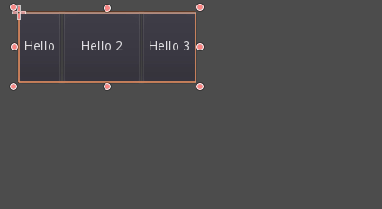
子ボタンのサイズを変更する HBoxContainer の例。
コンテナの本当の長所は、コンテナを(ノードとして)ネストできることです。これにより、簡単にサイズ変更できる非常に複雑なレイアウトを作成できます。
サイズ指定オプション
コンテナにノードを追加する場合、コンテナが各子ノードを扱う方法は、主に container sizing options に依存します。これらのフラグは、コンテナ の子である コントロール のレイアウトを調べることで見つけることができます。
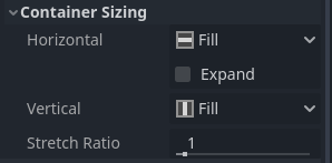
Sizing options are independent for vertical and horizontal sizing and not all containers make use of them (but most do):
Fill: コントロールがコンテナ内の指定された領域を 塗りつぶす ようにします。コントロールが Expand かどうかに関係なく(下記参照)、これがオンに切り替えられると、指定された領域が 塗りつぶされ ます(これがデフォルトです)。
Expand: Attempts to use as much space as possible in the parent container (in each axis). Controls that don't expand will be pushed away by those that do. Between expanding controls, the amount of space they take from each other is determined by the Stretch Ratio (see below). This option is only available when the parent Container is of the right type, for example the HBoxContainer has this option for horizontal sizing.
Shrink Begin When expanding, try to remain at the left or top of the expanded area.
Shrink Center When expanding, try to remain at the center of the expanded area.
Shrink End When expanding, try to remain at the right or bottom of the expanded area.
Stretch Ratio: The ratio of how much expanded controls take up the available space in relation to each other. A control with "2", will take up twice as much available space as one with "1".
これらのフラグとさまざまなコンテナを試して、それらがどのように機能するかをよりよく把握することをお勧めします。
コンテナの種類
Godotはさまざまな目的に役立てるため、すぐに使用できるいくつかのコンテナタイプを提供します:
ボックスコンテナ
Arranges child controls vertically or horizontally (via HBoxContainer and VBoxContainer). In the opposite of the designated direction (as in, vertical for a horizontal container), it just expands the children.
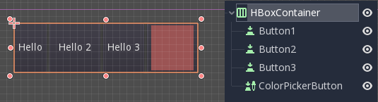
These containers make use of the Stretch Ratio property for children with the Expand flag set.
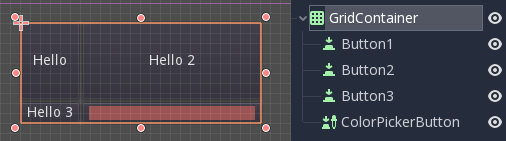
グリッドコンテナ
グリッドレイアウトに子コントロールを配置します(GridContainer を介して、列の数量を指定する必要があります)。垂直および水平の両方の展開フラグを使用します。
マージンコンテナ
子コントロールは、このコントロールの境界に向かって展開されます(MarginContainer を使用)。テーマの設定に応じて余白にパディングが追加されます。
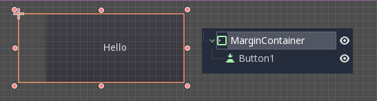
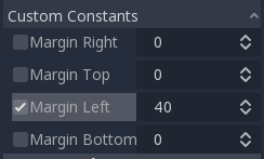
Again, keep in mind that the margins are a Theme value, so they need to be edited from the constants overrides section of each control:
タブコンテナ
複数の子コントロールを (TabContainer を使用して) 積み重ねて、current コントロールのみが見える状態で表示します。
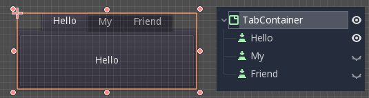
current を変更するには、コンテナの上部にあるタブをクリックします:
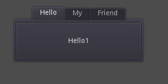
タイトルはデフォルトでノード名から生成されます(ただし、TabContainer APIを使用してオーバーライドできます)。
タブの配置や StyleBox などの設定は、TabContainer テーマのオーバーライドで変更できます。
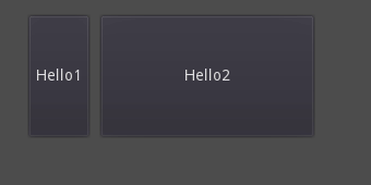
分割コンテナ
Arranges child controls vertically or horizontally and creates grabbers between them (via HSplitContainer and VSplitContainer). Respects both horizontal and vertical expand flags, as well as Stretch Ratio.
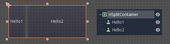
The grabbers can be dragged around to change the size relation between the children:
パネルコンテナ
A container that draws a StyleBox, then expands children to cover its whole area (via PanelContainer, respecting the StyleBox margins). It respects both the horizontal and vertical sizing options.
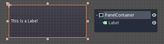
This container is useful as a top-level control, or just to add custom backgrounds to sections of a layout.
FoldableContainer
A container that can be expanded/collapsed (via FoldableContainer). Child controls are hidden when it is collapsed.
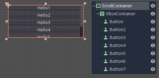
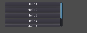
スクロールコンテナ
Accepts a single child node. If the child node is bigger than the container, scrollbars will be added to allow panning the node around (via ScrollContainer). Both vertical and horizontal size options are respected, and the behavior can be turned on or off per axis in the properties.
マウスホイールとタッチドラッグ(タッチが使用可能な場合)も、子コントロールをパンするための有効な方法です。
上記の例のように、このコンテナを使用する最も一般的な方法の1つは、VBoxContainer を子として使用することです。
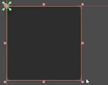
AspectRatioContainer
A container type that arranges its child controls in a way that preserves their proportions automatically when the container is resized. (via AspectRatioContainer). It has multiple stretch modes, providing options for adjusting the child controls' sizes concerning the container: "fill," "width control height," "height control width," and "cover."
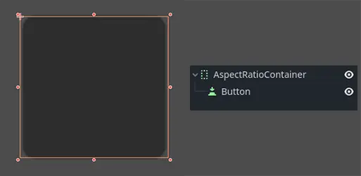
It is useful when you have a container that needs to be dynamic and responsive to different screen sizes, and you want the child elements to scale proportionally without losing their intended shapes.
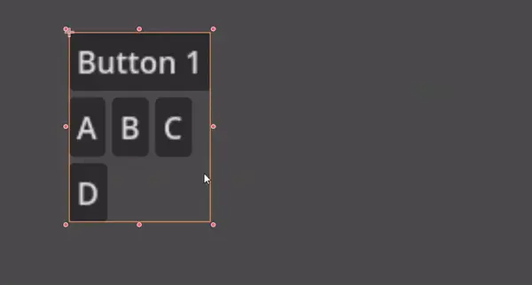
FlowContainer
FlowContainer is a container that arranges its child controls either horizontally or vertically (via HFlowContainer and via VFlowContainer). When the available space runs out, it wraps the children to the next line or column, similar to how text wraps in a book.
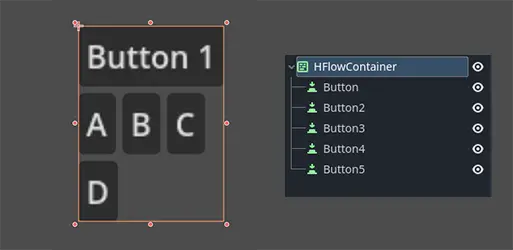
It is useful for creating flexible layouts where the child controls adjust automatically to the available space without overlapping.
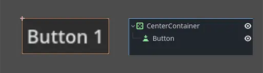
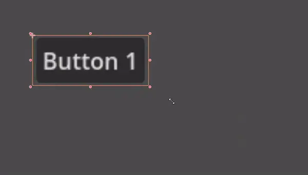
CenterContainer
CenterContainer is a container that automatically keeps all of its child controls centered within it at their minimum size. It ensures that the child controls are always aligned to the center, making it easier to create centered layouts without manual positioning (via CenterContainer).
SubViewportContainer
This is a special control that will only accept a single Viewport node as child, and it will display it as if it was an image (via SubViewportContainer).
カスタムコンテナの作成
It is possible to create a custom container using a script. Here is an example of a container that fits children to its size:
extends Container

func _notification(what):
    if what == NOTIFICATION_SORT_CHILDREN:
        # Must re-sort the children
        for c in get_children():
            # Fit to own size
            fit_child_in_rect(c, Rect2(Vector2(), size))

func set_some_setting():
    # Some setting changed, ask for children re-sort.
    queue_sort()
using Godot;

public partial class CustomContainer : Container
{
    public override void _Notification(int what)
    {
        if (what == NotificationSortChildren)
        {
            // Must re-sort the children
            foreach (Control c in GetChildren())
            {
                // Fit to own size
                FitChildInRect(c, new Rect2(new Vector2(), Size));
            }
        }
    }

    public void SetSomeSetting()
    {
        // Some setting changed, ask for children re-sort.
        QueueSort();
    }
}