Work in progress
The content of this page was not yet updated for Godot
4.2
and may be outdated. If you know how to improve this page or you can confirm
that it's up to date, feel free to open a pull request.
使用容器
Anchors 是 GUI 中处理基本多分辨率时应对不同纵横比的有效方法。
对于更复杂的用户界面, 它们可能会变得难以使用.
这通常是游戏的情况下, 如角色扮演类, 在线聊天, 大富翁类或模拟类游戏. 另一个需要更高级布局功能的常见情况是游戏内工具(或者仅仅是工具).
这些情况需要一个更强大的类似操作系统的用户界面,具有先进的布局和格式。用 Container 会更方便。
容器布局
容器提供了巨大的布局能力(例如,Godot编辑器的用户界面就是完全使用它们完成的):
当使用 Container 派生的节点时,所有作为子项的 Control 节点都会放弃自我定位能力。这意味着容器将控制它们的位置,任何手动更改这些节点的尝试,都将在它们的父节点下一次调整大小时被忽略或失效。
同样,调整 Container 派生节点的大小时,它的所有子节点都将根据它重新定位,其行为基于所用的容器类型:
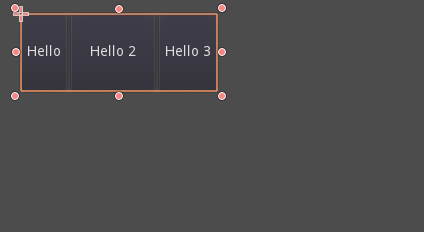
HBoxContainer 调整子按钮大小的例子。
容器的真正优势在于它们可以嵌套(作为节点), 允许创建非常复杂的布局, 调整毫不费力.
大小选项
When adding a node to a container, the way the container treats each child depends mainly on their container sizing options. These options can be found by inspecting the layout of any Control that is a child of a Container.
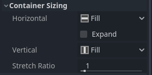
Sizing options are independent for vertical and horizontal sizing and not all containers make use of them (but most do):
Fill填充 : 确保控件 fills填充 容器内指定的区域. 无论控件是否 expands扩展 (见下面), 当此选项被选中时(默认情况), 只 填充 指定区域.
Expand: Attempts to use as much space as possible in the parent container (in each axis). Controls that don't expand will be pushed away by those that do. Between expanding controls, the amount of space they take from each other is determined by the Stretch Ratio (see below). This option is only available when the parent Container is of the right type, for example the HBoxContainer has this option for horizontal sizing.
Shrink Begin When expanding, try to remain at the left or top of the expanded area.
Shrink Center When expanding, try to remain at the center of the expanded area.
Shrink End When expanding, try to remain at the right or bottom of the expanded area.
Stretch Ratio: The ratio of how much expanded controls take up the available space in relation to each other. A control with "2", will take up twice as much available space as one with "1".
建议使用这些标记和不同的容器进行试验, 以便更好地了解它们是如何工作的.
容器类型
Godot提供了几种开箱即用的容器类型, 因为它们有不同的用途:
盒式容器
将子控件垂直或者水平排列(使用 HBoxContainer 和 VBoxContainer )。而在相对方向上(比如水平容器的垂直方向),子节点会被扩展。
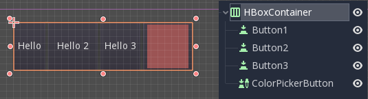
这些容器会用到设置了 Expand(扩展) 选项的子节点的 Ratio(比例) 属性。
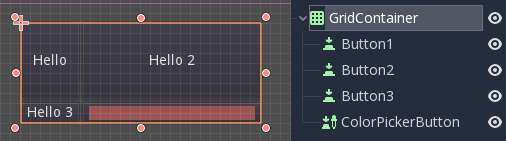
网格容器
将子控件按照网格排列(使用 GridContainer ,必须指定列数),会同时用到垂直和水平扩展选项。
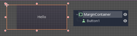
边距容器
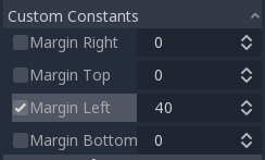
将子节点扩展到该控件的边界(使用 MarginContainer ),会根据主题的设置来添加不同大小的边距。
同样, 请记住, 边距是一个 Theme 值, 所以它们需要从每个控件的常量重写部分进行编辑:
选项卡容器
允许你将多个子控件堆叠在一起(使用 TabContainer ),只会显示 当前 控件。
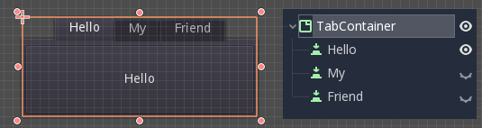
点击容器顶部的选项卡可以更改 当前 控件:
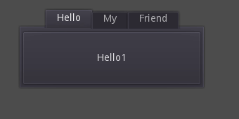
标题默认是根据节点名称生成的(尽管可以通过 TabContainer 的 API 重写)。
可以在 TabContainer 的主题覆盖项中修改类似选项卡位置和 StyleBox 等设置。
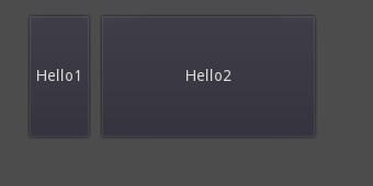
拆分容器
只接受单个或者两个子控件,会将它们相邻放置,中间是分隔线(使用 HSplitContainer 和 VSplitContainer ),会使用到水平和垂直选项以及 Ratio 属性。
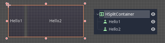
可以通过拖动分隔线来调整两个子节点所占区域的大小:
PanelContainer
A container that draws a StyleBox, then expands children to cover its whole area (via PanelContainer, respecting the StyleBox margins). It respects both the horizontal and vertical sizing options.
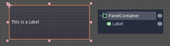
这个容器作为顶层非常有用, 或者只是为布局各个部分添加自定义背景.
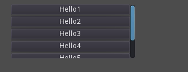
ScrollContainer
Accepts a single child node. If this node is bigger than the container, scrollbars will be added to allow panning the node around (via ScrollContainer). Both vertical and horizontal size options are respected, and the behavior can be turned on or off per axis in the properties.
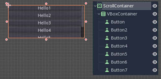
鼠标滚轮和触摸拖动(当触摸可用时)也是平移子控件的有效方法.
正如上面的例子中所展示的,使用此容器最常见的方法之一,是将 VBoxContainer 作为子容器一起使用。
AspectRatioContainer
A container type that arranges its child controls in a way that preserves their proportions automatically when the container is resized. (via AspectRatioContainer). It has multiple stretch modes, providing options for adjusting the child controls' sizes concerning the container: "fill," "width control height," "height control width," and "cover."
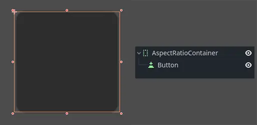
useful when you have a container that needs to be dynamic and responsive to different screen sizes, and you want the child elements to scale proportionally without losing their intended shapes.
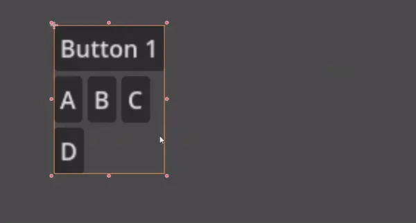
FlowContainer
FlowContainer is a container that arranges its child controls either horizontally or vertically, (via HFlowContainer and via VFlowContainer). and when the available space runs out, it wraps the children to the next line or column, similar to how text wraps in a book.
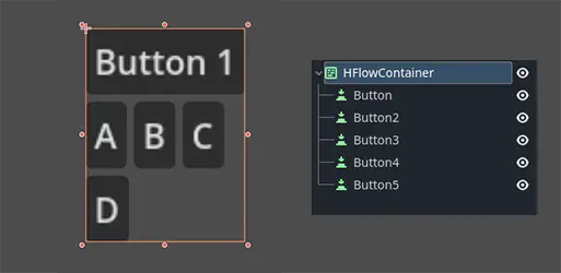
useful for creating flexible layouts where the child controls adjust automatically to the available space without overlapping.
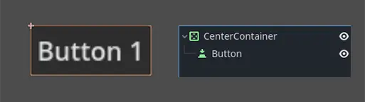
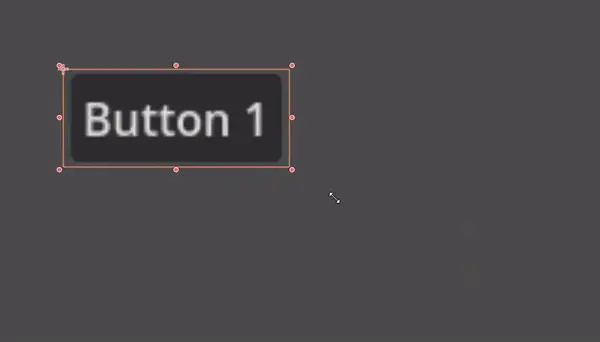
CenterContainer
CenterContainer is a container that automatically keeps all of its child controls centered within it at their minimum size. It ensures that the child controls are always aligned to the center, making it easier to create centered layouts without manual positioning. (via CenterContainer).
SubViewportContainer
This is a special control that will only accept a single Viewport node as child, and it will display it as if it was an image (via SubViewportContainer).
创建自定义容器
It is possible to create a custom container using a script. Here is an example of a container that fits children to its rect size:
extends Container

func _notification(what):
    if what == NOTIFICATION_SORT_CHILDREN:
        # Must re-sort the children
        for c in get_children():
            # Fit to own size
            fit_child_in_rect(c, Rect2(Vector2(), rect_size))

func set_some_setting():
    # Some setting changed, ask for children re-sort.
    queue_sort()
using Godot;

public partial class CustomContainer : Container
{
    public override void _Notification(int what)
    {
        if (what == NotificationSortChildren)
        {
            // Must re-sort the children
            foreach (Control c in GetChildren())
            {
                // Fit to own size
                FitChildInRect(c, new Rect2(new Vector2(), RectSize));
            }
        }
    }

    public void SetSomeSetting()
    {
        // Some setting changed, ask for children re-sort.
        QueueSort();
    }
}