Attention: Here be dragons
This is the latest
(unstable) version of this documentation, which may document features
not available in or compatible with released stable versions of Godot.
Checking the stable version of the documentation...
Usar Containers
Anchors son una forma eficiente de manejar diferentes relaciones de aspecto para el manejo básico de resolución múltiple en las GUI.
En el caso de las interfaces de usuario más complejas, pueden llegar a ser difíciles de usar.
Este es a menudo el caso de los juegos, como los RPG, los chats online, los tycoons o las simulaciones. Otro caso común en el que pueden requerirse características de diseño más avanzadas es el de las herramientas dentro del juego (o simplemente las herramientas).
Todas estas situaciones requieren una interfaz de usuario más capaz, como un sistema operativo, con un diseño y formato avanzados. Para eso, Containers son más útiles.
Esquema de Containers
Los contenedores proporcionan una enorme cantidad de potencia de diseño (por ejemplo, la interfaz de usuario del editor de Godot está totalmente hecha con ellos):
Cuando se usa un nodo Container derivado, todos los nodos Control hijos renuncian a su propia capacidad de posicionamiento. Esto significa que el Contenedor controlará su posicionamiento y cualquier intento de alterar manualmente estos nodos será o bien ignorado o invalidado la próxima vez que su padre sea redimensionado.
De la misma manera, cuando un nodo derivado de Contenedor es redimensionado, todos sus hijos serán reubicados de acuerdo a él, con un comportamiento basado en el tipo de contenedor utilizado:
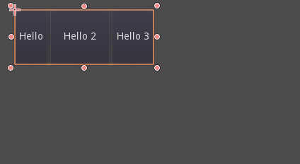
Ejemplo de HBoxContainer cambiando el tamaño de los botones para niños.
La verdadera fuerza de los contenedores es que pueden anidarse (como nodos), lo que permite crear diseños muy complejos que se redimensionan sin esfuerzo.
Sizing options
When adding a node to a container, the way the container treats each child depends mainly on their container sizing options. These options can be found by inspecting the layout of any Control that is a child of a Container.
Sizing options are independent for vertical and horizontal sizing and not all containers make use of them (but most do):
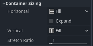
Fill: Asegura que el control llena el área designada dentro del contenedor. No importa si un control se expande o no (ver más abajo), sólo llenará el área designada cuando éste esté activado (es por defecto).
Expand: Attempts to use as much space as possible in the parent container (in each axis). Controls that don't expand will be pushed away by those that do. Between expanding controls, the amount of space they take from each other is determined by the Stretch Ratio (see below). This option is only available when the parent Container is of the right type, for example the HBoxContainer has this option for horizontal sizing.
Shrink Begin When expanding, try to remain at the left or top of the expanded area.
Shrink Center When expanding, try to remain at the center of the expanded area.
Shrink End When expanding, try to remain at the right or bottom of the expanded area.
Stretch Ratio: The ratio of how much expanded controls take up the available space in relation to each other. A control with "2", will take up twice as much available space as one with "1".
Se recomienda experimentar con estas banderas y diferentes contenedores para comprender mejor cómo funcionan.
Tipos de Container
Godot proporciona varios tipos de contenedores prefabricados que sirven para diferentes propósitos:
Contenedores Box
Arranges child controls vertically or horizontally (via HBoxContainer and VBoxContainer). In the opposite of the designated direction (as in, vertical for a horizontal container), it just expands the children.
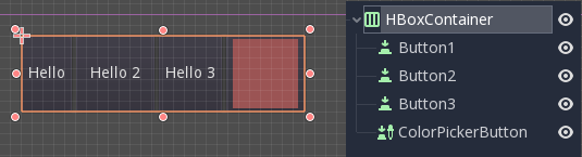
These containers make use of the Stretch Ratio property for children with the Expand flag set.
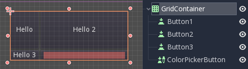
Contenedor Rejilla
Dispone los controles hijo en un diseño de cuadrícula (mediante GridContainer, se debe especificar la cantidad de columnas). Utiliza las banderas de expansión vertical y horizontal.
Contenedor Margen
Child controls are expanded towards the bounds of this control (via MarginContainer). Padding will be added on the margins depending on the theme configuration.
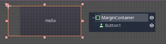
De nuevo, ten en cuenta que los márgenes son un valor Theme, por lo que deben ser editados desde la sección de sobreescrituras constantes de cada control:
Contenedor Pestaña
Permite colocar varios controles hijo apilados unos encima de otros (vía TabContainer), con sólo el corriente visible.
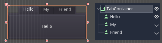
El cambio de la corriente se realiza a través de las pestañas situadas en la parte superior del contenedor, mediante un clic:
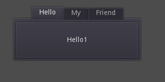
Los títulos se generan a partir de los nombres de los nodos por defecto (aunque pueden ser anulados a través de la API TabContainer).
Los ajustes como la colocación de las pestañas y StyleBox pueden ser modificados en el tema TabContainer.
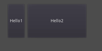
Contenedor Divisor
Arranges child controls vertically or horizontally and creates grabbers between them (via HSplitContainer and VSplitContainer). Respects both horizontal and vertical expand flags, as well as Stretch Ratio.
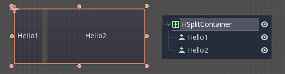
The grabbers can be dragged around to change the size relation between the children:
Panel Container
A container that draws a StyleBox, then expands children to cover its whole area (via PanelContainer, respecting the StyleBox margins). It respects both the horizontal and vertical sizing options.
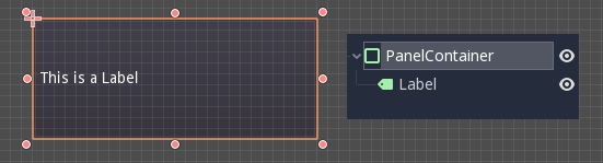
This container is useful as a top-level control, or just to add custom backgrounds to sections of a layout.
FoldableContainer
A container that can be expanded/collapsed (via FoldableContainer). Child controls are hidden when it is collapsed.
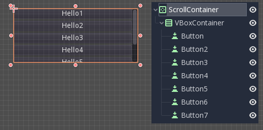
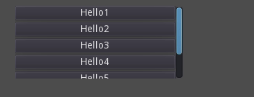
Scroll Container
Accepts a single child node. If the child node is bigger than the container, scrollbars will be added to allow panning the node around (via ScrollContainer). Both vertical and horizontal size options are respected, and the behavior can be turned on or off per axis in the properties.
La rueda del ratón y el arrastre táctil (cuando el tacto está disponible) también son formas válidas de desplazar el control del hijo.
Como en el ejemplo anterior, una de las formas más comunes de usar este contenedor es junto con un VBoxContainer de hijo.
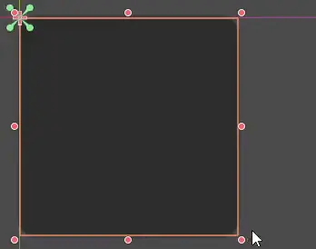
AspectRatioContainer
A container type that arranges its child controls in a way that preserves their proportions automatically when the container is resized. (via AspectRatioContainer). It has multiple stretch modes, providing options for adjusting the child controls' sizes concerning the container: "fill," "width control height," "height control width," and "cover."
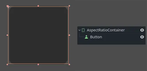
It is useful when you have a container that needs to be dynamic and responsive to different screen sizes, and you want the child elements to scale proportionally without losing their intended shapes.
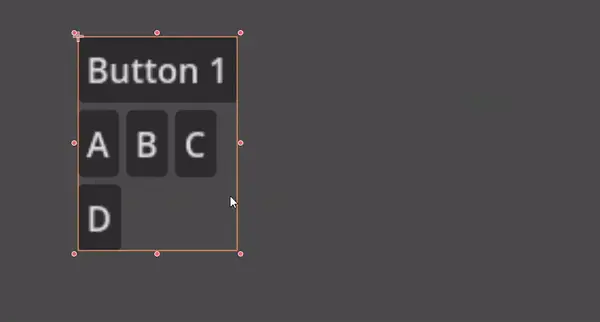
FlowContainer
FlowContainer is a container that arranges its child controls either horizontally or vertically (via HFlowContainer and via VFlowContainer). When the available space runs out, it wraps the children to the next line or column, similar to how text wraps in a book.
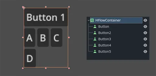
It is useful for creating flexible layouts where the child controls adjust automatically to the available space without overlapping.
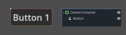
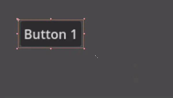
CenterContainer
CenterContainer is a container that automatically keeps all of its child controls centered within it at their minimum size. It ensures that the child controls are always aligned to the center, making it easier to create centered layouts without manual positioning (via CenterContainer).
SubViewportContainer
This is a special control that will only accept a single Viewport node as child, and it will display it as if it was an image (via SubViewportContainer).
Crear contenedores personalizados
It is possible to create a custom container using a script. Here is an example of a container that fits children to its size:
extends Container

func _notification(what):
    if what == NOTIFICATION_SORT_CHILDREN:
        # Must re-sort the children
        for c in get_children():
            # Fit to own size
            fit_child_in_rect(c, Rect2(Vector2(), size))

func set_some_setting():
    # Some setting changed, ask for children re-sort.
    queue_sort()
using Godot;

public partial class CustomContainer : Container
{
    public override void _Notification(int what)
    {
        if (what == NotificationSortChildren)
        {
            // Must re-sort the children
            foreach (Control c in GetChildren())
            {
                // Fit to own size
                FitChildInRect(c, new Rect2(new Vector2(), Size));
            }
        }
    }

    public void SetSomeSetting()
    {
        // Some setting changed, ask for children re-sort.
        QueueSort();
    }
}