Attention: Here be dragons
This is the latest
(unstable) version of this documentation, which may document features
not available in or compatible with released stable versions of Godot.
Checking the stable version of the documentation...
Utilisation de Containers
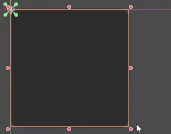
Les ancres sont un moyen efficace de gérer les différents rapports de taille pour une gestion basique des résolutions multiples dans les interfaces graphiques.
Pour les interfaces utilisateur plus complexes, elles peuvent devenir difficiles à utiliser.
C'est souvent le cas des jeux, tels que les RPG, les chats en ligne, les tycoons ou les simulations. Un autre cas courant où des fonctionnalités de mise en page plus avancées peuvent être nécessaires est celui des outils dans le jeu (ou simplement des outils).
Toutes ces situations nécessitent une interface utilisateur plus performante, de type OS, avec une mise en page et un formatage avancés. Pour cela, Containers sont plus utiles.
Conteneurs de disposition
Les conteneurs fournissent une énorme puissance de mise en page (par exemple, l'interface utilisateur de l'éditeur Godot est entièrement réalisée avec eux) :
Quand un nœud dérivé de Container est utilisé, tous les nœuds enfants Control abandonnent leur propre capacité de positionnement. Cela signifie que le Container contrôlera leur positionnement et que toute tentative de modification manuelle de ces nœuds sera soit ignorée soit invalidée lors du prochain redimensionnement de leur parent.
De même, lorsqu'un nœud dérivé de Container est redimensionné, tous ses enfants seront repositionnés en fonction de celui-ci, avec un comportement basé sur le type de conteneur utilisé :
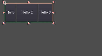
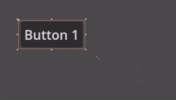
Exemple de HBoxContainer redimensionnant les boutons enfants.
La vraie force des conteneurs est qu'ils peuvent être emboîtés (en tant que nœuds), permettant la création de mises en page très complexes qui se redimensionnent sans effort.
Sizing options
When adding a node to a container, the way the container treats each child depends mainly on their container sizing options. These options can be found by inspecting the layout of any Control that is a child of a Container.
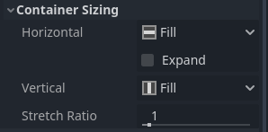
Sizing options are independent for vertical and horizontal sizing and not all containers make use of them (but most do):
Fill : Veille à ce que le control remplisse la zone désignée à l'intérieur du conteneur. Peu importe si un control s'étend ou non (voir ci-dessous), il ne remplit la zone désignée que lorsque ce drapeau est activée (c'est le cas par défaut).
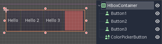
Expand: Attempts to use as much space as possible in the parent container (in each axis). Controls that don't expand will be pushed away by those that do. Between expanding controls, the amount of space they take from each other is determined by the Stretch Ratio (see below). This option is only available when the parent Container is of the right type, for example the HBoxContainer has this option for horizontal sizing.
Shrink Begin When expanding, try to remain at the left or top of the expanded area.
Shrink Center When expanding, try to remain at the center of the expanded area.
Shrink End When expanding, try to remain at the right or bottom of the expanded area.
Stretch Ratio: The ratio of how much expanded controls take up the available space in relation to each other. A control with "2", will take up twice as much available space as one with "1".
Il est recommandé d'expérimenter avec ces drapeaux et différents conteneurs pour mieux comprendre leur fonctionnement.
Types de conteneurs
Godot fournit plusieurs types de conteneurs de base car ils servent à des fins différentes :
Box Containers
Arranges child controls vertically or horizontally (via HBoxContainer and VBoxContainer). In the opposite of the designated direction (as in, vertical for a horizontal container), it just expands the children.
These containers make use of the Stretch Ratio property for children with the Expand flag set.
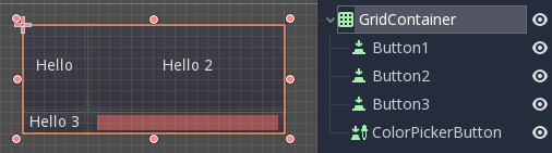
Conteneur de grille
Arrange les controls enfants dans une disposition en grille (via GridContainer, la quantité de colonnes doit être spécifiée). Utilise les flags expand verticale et horizontale.
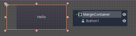
Conteneur de marge
Les controls enfants sont étendus vers les limites de ce control (via MarginContainer). Des espaces seront ajoutés dans les marges en fonction de la configuration du thème.
Encore une fois, gardez à l'esprit que les marges sont une valeur de Theme, donc elles doivent être éditées dans la section de réécriture des constantes de chaque Control :

Conteneur d'onglet
Vous permet de placer plusieurs contrôles enfants empilés les uns sur les autres (via TabContainer), avec seulement celui qui est current de visible.

Changer de current se fait via les onglets situés en haut du conteneur, par un clic :
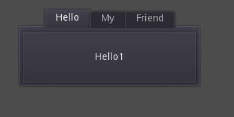
Les titres sont générés par défaut à partir des noms de nœuds (bien qu'ils puissent être réécrit via l'API TabContainer).
Les paramètres tels que le placement des onglets et la StyleBox peuvent être modifiés en réécrivant le thème du TabContainer.
Split Container
Arranges child controls vertically or horizontally and creates grabbers between them (via HSplitContainer and VSplitContainer). Respects both horizontal and vertical expand flags, as well as Stretch Ratio.
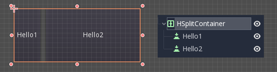
The grabbers can be dragged around to change the size relation between the children:

PanelContainer
A container that draws a StyleBox, then expands children to cover its whole area (via PanelContainer, respecting the StyleBox margins). It respects both the horizontal and vertical sizing options.
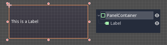
This container is useful as a top-level control, or just to add custom backgrounds to sections of a layout.
FoldableContainer
A container that can be expanded/collapsed (via FoldableContainer). Child controls are hidden when it is collapsed.
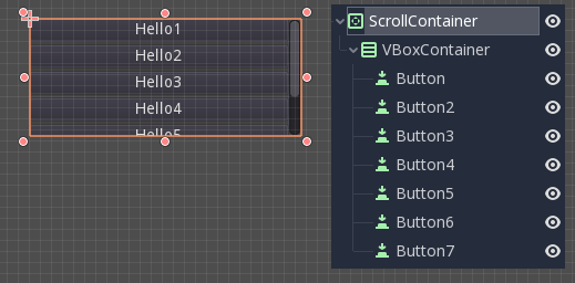
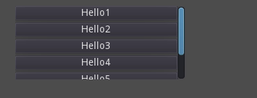
ScrollContainer
Accepts a single child node. If the child node is bigger than the container, scrollbars will be added to allow panning the node around (via ScrollContainer). Both vertical and horizontal size options are respected, and the behavior can be turned on or off per axis in the properties.
La molette de la souris et le glissement tactile (lorsque le tactile est disponible) sont également des moyens valables de faire pivoter le enfant control.
Comme dans l'exemple ci-dessus, une des façons les plus courantes d'utiliser ce conteneur est de l'utiliser avec un VBoxContainer en tant qu'enfant.
AspectRatioContainer
A container type that arranges its child controls in a way that preserves their proportions automatically when the container is resized. (via AspectRatioContainer). It has multiple stretch modes, providing options for adjusting the child controls' sizes concerning the container: "fill," "width control height," "height control width," and "cover."
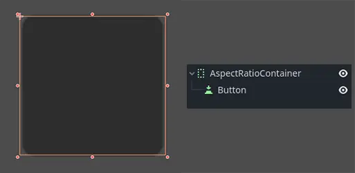
It is useful when you have a container that needs to be dynamic and responsive to different screen sizes, and you want the child elements to scale proportionally without losing their intended shapes.
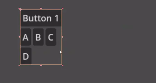
FlowContainer
FlowContainer is a container that arranges its child controls either horizontally or vertically (via HFlowContainer and via VFlowContainer). When the available space runs out, it wraps the children to the next line or column, similar to how text wraps in a book.
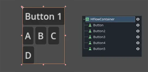
It is useful for creating flexible layouts where the child controls adjust automatically to the available space without overlapping.
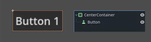
CenterContainer
CenterContainer is a container that automatically keeps all of its child controls centered within it at their minimum size. It ensures that the child controls are always aligned to the center, making it easier to create centered layouts without manual positioning (via CenterContainer).
SubViewportContainer
C'est un contrôle spécial qui n'acceptera qu'un seul nœud Viewport comme enfant, et il l'affichera comme si c'était une image (via SubViewportContainer).
Création de conteneurs personnalisés
It is possible to create a custom container using a script. Here is an example of a container that fits children to its size:
extends Container

func _notification(what):
    if what == NOTIFICATION_SORT_CHILDREN:
        # Must re-sort the children
        for c in get_children():
            # Fit to own size
            fit_child_in_rect(c, Rect2(Vector2(), size))

func set_some_setting():
    # Some setting changed, ask for children re-sort.
    queue_sort()
using Godot;

public partial class CustomContainer : Container
{
    public override void _Notification(int what)
    {
        if (what == NotificationSortChildren)
        {
            // Must re-sort the children
            foreach (Control c in GetChildren())
            {
                // Fit to own size
                FitChildInRect(c, new Rect2(new Vector2(), Size));
            }
        }
    }

    public void SetSomeSetting()
    {
        // Some setting changed, ask for children re-sort.
        QueueSort();
    }
}