Attention: Here be dragons
This is the latest
(unstable) version of this documentation, which may document features
not available in or compatible with released stable versions of Godot.
Checking the stable version of the documentation...
使用容器
錨點 是在 GUI 中進行基礎多解析度與不同螢幕比例處理的高效方法。
對於更複雜的使用者介面,錨點就會變得難以操作。
這通常發生在遊戲中,例如角色扮演、線上聊天、經營或模擬類型。另一個常見需要進階佈局功能的場景是遊戲內工具(或一般工具)。
這些情境都需要更強大、類似作業系統的使用者介面,具備進階佈局與格式功能。此時,Container 會更適合。
容器佈局
容器提供了強大的佈局功能(例如,Godot 編輯器的使用者介面就是完全用容器製作的):
當你使用 Container 衍生節點時,所有作為子項的 Control 節點都會放棄自身定位能力。這表示 容器 會接管它們的位置控制,任何手動調整這些節點位置的動作,都會在父節點下次調整大小時被忽略或覆蓋。
同樣地,當 Container 衍生節點被調整大小時,它的所有子節點會根據容器類型自動重新定位:
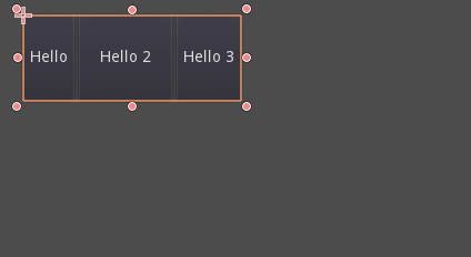
HBoxContainer 調整子按鈕大小的範例。
容器最大的優勢在於它們可以巢狀(作為節點),讓你能輕鬆建立可自動調整的複雜佈局。
尺寸選項
將節點加入容器時,容器如何處理每個子節點,主要取決於它們的 尺寸旗標。這些旗標可在 Container 的子 Control 節點的佈局屬性中找到。
尺寸旗標在垂直和水平方向上是獨立的,雖然不是每種容器都會用到,但大多數容器都會使用這些旗標:
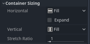
填充(Fill):確保控制項 填滿 容器內指定區域。不論控制項是否 擴展*(見下方),只有啟用這個選項時(預設為開啟),才會 *填充 指定區域。
擴展(Expand):在父容器內(於各軸)盡可能佔用空間。未啟用擴展的控制項會被啟用擴展的控制項擠開。多個擴展控制項之間的空間分配,取決於 比例(Stretch Ratio)*(詳見下方)。此選項僅當父容器支援時才可用,例如 *HBoxContainer 支援水平擴展。
收縮起始(Shrink Begin):當啟用擴展時,盡量保持在擴展區域的左側或頂部。
收縮置中(Shrink Center):當啟用擴展時,盡量保持在擴展區域的中央。
收縮結尾(Shrink End):當啟用擴展時,盡量保持在擴展區域的右側或底部。
比例(Stretch Ratio):決定多個啟用擴展的控制項相互分配可用空間的比例。例如,比例設為「2」的控制項將獲得比例為「1」的兩倍空間。
建議實際嘗試這些旗標與不同類型的容器,以更深入理解它們的運作原理。
容器類型
Godot 內建多種容器類型,以因應不同的使用需求:
盒式容器
將子控制項依指定方向(垂直或水平)排列(分別為 HBoxContainer 和 VBoxContainer)。在非排列方向(例如水平方向的容器在垂直方向),子節點只會被擴展。
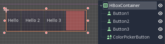
這些容器會對啟用 擴展(Expand) 的子節點,套用 比例(Stretch Ratio) 屬性。
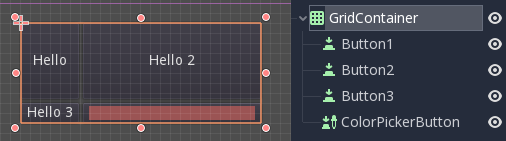
網格容器
將子控制項以網格方式排列(使用 GridContainer,須設定欄數),同時支援垂直和水平擴展旗標。
邊距容器
子控制項會被擴展至本容器邊界(使用 MarginContainer)。邊距(Padding)會依據主題設定自動加入。
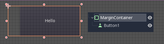
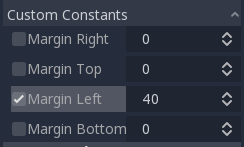
請注意,邊距屬於 主題 設定值,需在各控制項的「常數覆寫」欄位中調整:
分頁容器
允許將多個子控制項堆疊(使用 TabContainer),僅顯示當前(目前)的那一個。
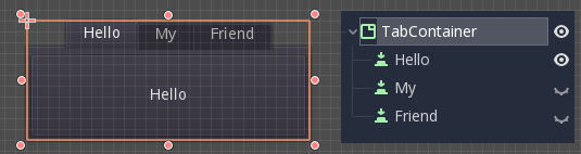
可以透過點擊容器頂端的分頁來切換顯示 目前 的子控制項:
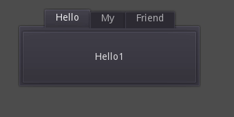
分頁標題預設會根據節點名稱產生(也可透過 TabContainer API 進行覆寫)。
如分頁位置、StyleBox 等設定,可於 TabContainer 的主題覆寫中調整。
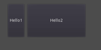
分割容器
Arranges child controls vertically or horizontally and creates grabbers between them (via HSplitContainer and VSplitContainer). Respects both horizontal and vertical expand flags, as well as Stretch Ratio.
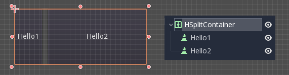
The grabbers can be dragged around to change the size relation between the children:
PanelContainer
這個容器會繪製 StyleBox,並將子節點擴展覆蓋整個區域(通過 PanelContainer,會考慮 StyleBox 邊距)。同時支援水平與垂直尺寸選項。
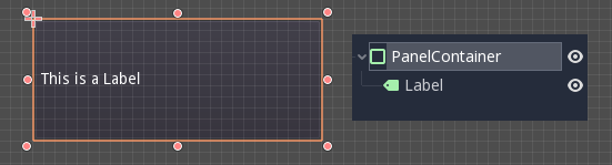
這個容器適合用作頂層容器,也很適合為佈局區塊新增自訂背景。
FoldableContainer
可展開/收合的容器(透過 FoldableContainer)。收合時會隱藏其子控制項。
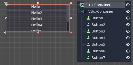
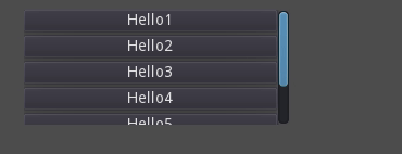
ScrollContainer
只接受一個子節點。若子節點的尺寸大於容器,會加入捲動條以便平移該節點(透過 ScrollContainer)。垂直與水平的尺寸選項都會被遵守,且可在屬性中針對各軸向啟用或停用此行為。
你也可以用滑鼠滾輪或觸控拖曳(若裝置支援)來移動子控制項。
如上例所示,這個容器最常見的用法,是配合 VBoxContainer 作為子節點共同使用。
比例容器
這是一種會在容器調整大小時,自動保持子控制項長寬比例的容器(使用 AspectRatioContainer)。它具備多種伸展模式,包括「填滿」、「寬度控制高度」、「高度控制寬度」及「覆蓋」等選項,可彈性調整子控制項的尺寸
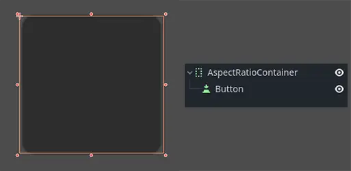
當你需要讓容器能夠動態因應不同螢幕尺寸,並希望子元素能維持比例縮放而不失真時,這個容器很實用。
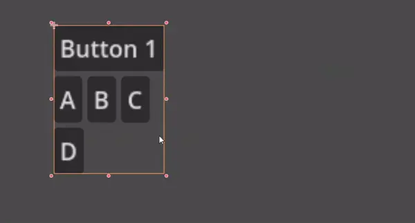
流式容器
FlowContainer 會將子控制項依水平方向或垂直方向排列(分別為 HFlowContainer 與 VFlowContainer)。當可用空間不足時,會自動換行或換欄,類似文字在書本中的換行。
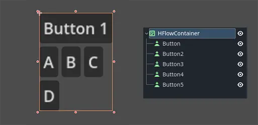
這種容器適合建立彈性佈局,讓子控制項自動依可用空間調整排列,避免重疊。
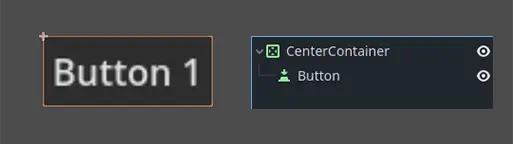
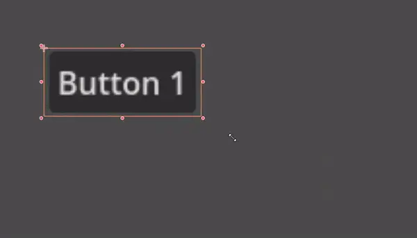
置中容器
置中容器會自動將所有子控制項以其最小尺寸置中對齊於容器內。不需手動調整,即可輕鬆實現置中佈局(使用 CenterContainer)。
SubViewportContainer
這是個特殊控制項,只能接受單一 Viewport 節點作為子節點,並將其當作圖片顯示(使用 SubViewportContainer)。
建立自訂容器
可以用腳本建立自訂容器。以下是一個會讓子節點適應自身大小的容器範例:
extends Container

func _notification(what):
    if what == NOTIFICATION_SORT_CHILDREN:
        # Must re-sort the children
        for c in get_children():
            # Fit to own size
            fit_child_in_rect(c, Rect2(Vector2(), size))

func set_some_setting():
    # Some setting changed, ask for children re-sort.
    queue_sort()
using Godot;

public partial class CustomContainer : Container
{
    public override void _Notification(int what)
    {
        if (what == NotificationSortChildren)
        {
            // Must re-sort the children
            foreach (Control c in GetChildren())
            {
                // Fit to own size
                FitChildInRect(c, new Rect2(new Vector2(), Size));
            }
        }
    }

    public void SetSomeSetting()
    {
        // Some setting changed, ask for children re-sort.
        QueueSort();
    }
}