Múltiples resoluciones
El problema de las resoluciones múltiples
Los desarrolladores suelen tener problemas para entender cuál es la mejor manera de admitir varias resoluciones en sus juegos. En el caso de los juegos de sobremesa y consola, esto es más o menos sencillo, ya que la mayoría de las relaciones de aspecto de pantalla son 16:9 y las resoluciones son estándar (720p, 1080p, 1440p, 4K, ...).
Para los juegos de móvil, al principio, fue fácil. Durante muchos años, el iPhone y el iPad usaron la misma resolución. Cuando se implementó Retina, sólo duplicaron la densidad de píxeles; la mayoría de los desarrolladores tuvieron que suministrar activos en resoluciones predeterminadas y dobles.
Hoy en día, esto ya no es así, ya que existen multitud de tamaños de pantalla, densidades y relaciones de aspecto diferentes. También son cada vez más populares los tamaños no convencionales, como las pantallas ultraanchas.
For 3D rendering, there is not much of a need to support multiple resolutions. Thanks to its vector-based nature, 3D geometry will just fill the screen based on the viewport size. For 2D and game UIs, this is a different matter, as art needs to be created using specific pixel sizes in software such as Photoshop, GIMP or Krita.
Dado que los diseños, las relaciones de aspecto, las resoluciones y las densidades de píxeles pueden cambiar tanto, ya no es posible diseñar interfaces para cada pantalla específica. Se debe utilizar otro método.
Una talla única para todos
Lo más habitual es utilizar una única resolución base y ajustarla a todo lo demás. Esta resolución es la que se espera que utilicen la mayoría de los jugadores (teniendo en cuenta su hardware). Para móviles, Google tiene útiles estadísticas en línea, y para sobremesa, Steam también lo hace.
Como ejemplo, Steam muestra que la resolución primaria de la pantalla más común es 1920×1080, por lo que un enfoque sensato es desarrollar un juego para esta resolución, y luego manejar el escalado para diferentes tamaños y relaciones de aspecto.
Godot proporciona varias herramientas útiles para hacer esto fácilmente.
Ver también
You can see how Godot's support for multiple resolutions works in action using the Multiple Resolutions and Aspect Ratios demo project.
Tamaño Base
El tamaño base de la ventana se puede especificar en Ajustes del Proyecto en la sección Display → Window.
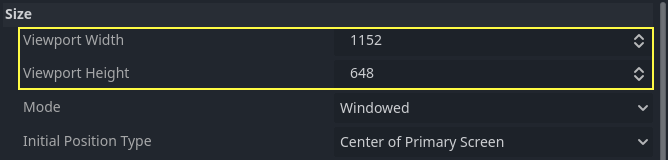
Sin embargo, lo que hace no es completamente obvio; el motor no intentará cambiar el monitor a esta resolución. Más bien, piensa en este ajuste como el "tamaño de diseño", es decir, el tamaño del área con la que trabajas en el editor. Este ajuste corresponde directamente al tamaño del rectángulo azul en el editor 2D.
A menudo es necesario soportar dispositivos con tamaños de pantalla y ventana diferentes a este tamaño base. Godot ofrece muchas maneras de controlar cómo se redimensionará el viewport y se estirará a diferentes tamaños de pantalla.
Nota
On this page, window refers to the screen area allotted to your game
by the system, while viewport refers to the root object (accessible
from get_tree().root) which the game controls to fill this screen area.
This viewport is a Window instance. Recall from the
introduction that all Window objects are viewports.
To configure the stretch base size at runtime from a script, use the
get_tree().root.content_scale_size property (see
Window.content_scale_size).
Changing this value can indirectly change the size of 2D elements. However, to
provide a user-accessible scaling option, using
Stretch Scale is recommended as it's easier to
adjust.
Nota
Godot sigue un enfoque moderno de múltiples resoluciones. El motor nunca cambiará la resolución del monitor por sí solo. Aunque cambiar la resolución del monitor es el enfoque más eficiente, también es el menos fiable, ya que puede dejar el monitor atascado en una resolución baja si el juego se cae. Esto es especialmente común en MacOS o Linux que no manejan los cambios de resolución tan bien como Windows.
Cambiar la resolución del monitor también elimina cualquier control del desarrollador del juego sobre el filtrado y el estiramiento de la relación de aspecto, lo que puede ser importante para asegurar la correcta visualización de los juegos de pixel art.
Además, cambiar la resolución del monitor hace que la entrada y salida del juego sea mucho más lenta, ya que el monitor tiene que cambiar la resolución cada vez que lo hace.
Cambiando el tamaño
There are several types of devices, with several types of screens, which
in turn have different pixel density and resolutions. Handling all of
them can be a lot of work, so Godot tries to make the developer's life a
little easier. The Viewport
node has several functions to handle resizing, and the root node of the
scene tree is always a viewport (scenes loaded are instanced as a child
of it, and it can always be accessed by calling
get_tree().root or get_node("/root")).
In any case, while changing the root Viewport params is probably the most flexible way to deal with the problem, it can be a lot of work, code and guessing, so Godot provides a set of parameters in the project settings to handle multiple resolutions.
Truco
To render 3D at a lower resolution than 2D elements (without needing separate viewports), you can use Godot's resolution scaling support. This is a good way to improve performance significantly in GPU-bottlenecked scenarios. This works with any stretch mode and stretch aspect combination.
Ajustes de estiramiento
Los ajustes de estiramiento se encuentran en los ajustes del proyecto y proporcionan varias opciones:
Modo de Estiramiento
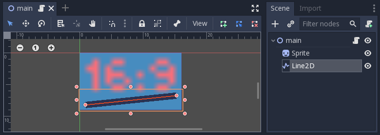
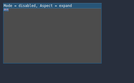
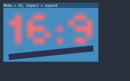
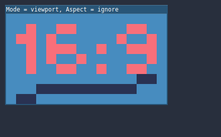
The Stretch Mode setting defines how the base size is stretched to fit the resolution of the window or screen. The animations below use a "base size" of just 16×9 pixels to demonstrate the effect of different stretch modes. A single sprite, also 16×9 pixels in size, covers the entire viewport, and a diagonal Line2D is added on top of it:
Modo de estiramiento = Desactivado (por defecto): No hay estiramiento. Una unidad en la escena corresponde a un píxel en la pantalla. En este modo, el ajuste de Stretch Aspect no tiene ningún efecto.
Stretch Mode = Canvas Items: In this mode, the base size specified in width and height in the project settings is stretched to cover the whole screen (taking the Stretch Aspect setting into account). This means that everything is rendered directly at the target resolution. 3D is unaffected, while in 2D, there is no longer a 1:1 correspondence between sprite pixels and screen pixels, which may result in scaling artifacts.
Modo de estiramiento = Viewport: El escalado de Viewport significa que el tamaño de la raíz Viewport se ajusta con precisión al tamaño base especificado en la sección 'Project Settings' Display. La escena se renderiza primero en este Viewport. Finalmente, esta ventana se escala para que se ajuste a la pantalla (teniendo en cuenta la configuración de Stretch Aspect).

To configure the stretch mode at runtime from a script, use the
get_tree().root.content_scale_mode property (see
Window.content_scale_mode
and the ContentScaleMode enum).
Aspecto de estiramiento
El segundo ajuste es el aspecto de estiramiento. Ten en cuenta que esto sólo tiene efecto si el Modo de estiramiento está configurado en algo distinto a Desactivado.
En las siguientes animaciones, notará áreas grises y negras. Las áreas negras son añadidas por el motor y no pueden ser dibujadas. Las áreas grises son parte de tu escena, y pueden ser dibujadas. Las áreas grises corresponden a la región fuera del marco azul que ves en el editor 2D.
Aspecto de estiramiento = Ignorar: Ignorar la relación de aspecto al estirar la pantalla. Esto significa que la resolución original se estirará para llenar exactamente la pantalla, incluso si es más ancha o más estrecha. Esto puede dar lugar a un estiramiento no uniforme: las cosas se ven más anchas o más altas de lo diseñado.
Aspecto de estiramiento = Mantener: Mantener la relación de aspecto al estirar la pantalla. Esto significa que el visor conserva su tamaño original independientemente de la resolución de la pantalla, y se añadirán barras negras en la parte superior/inferior de la pantalla ("letterboxing") o en los laterales ("pillarboxing").
Esta es una buena opción si conoces de antemano la relación de aspecto de tus dispositivos de destino, o si no quieres manejar diferentes relaciones de aspecto.

Aspecto de estiramiento = Mantener el ancho: Mantener la relación de aspecto al estirar la pantalla. Si la pantalla es más ancha que el tamaño de la base, se añaden barras negras a la izquierda y a la derecha (pillarboxing). Pero si la pantalla es más alta que la resolución de base, la vista crecerá en dirección vertical (y más contenido será visible hacia abajo). También puedes pensar en esto como "Expandir verticalmente".
Esta suele ser la mejor opción para crear GUIs o HUDs que escalen, por lo que algunos controles pueden anclarse al fondo (Tamaño y anclas).

Aspecto de estiramiento = Mantener la altura: Mantener la relación de aspecto al estirar la pantalla. Si la pantalla es más alta que el tamaño de la base, se añaden barras negras en la parte superior e inferior (letterboxing). Pero si la pantalla es más ancha que la resolución de base, la vista crecerá en la dirección horizontal (y más contenido será visible a la derecha). También puedes pensar en esto como "Expandir horizontalmente".
Esta suele ser la mejor opción para los juegos 2D que se desplazan horizontalmente (como corredores o plataformas).

Aspecto de estiramiento = Expandir: Mantenga la relación de aspecto al estirar la pantalla, pero no mantener ni el ancho ni la altura de la base. Dependiendo de la relación de aspecto de la pantalla, la vista será mayor en la dirección horizontal (si la pantalla es más ancha que el tamaño de la base) o en la dirección vertical (si la pantalla es más alta que el tamaño original).
Truco
Para admitir tanto el modo vertical como el horizontal con un factor de escala similar determinado automáticamente, configura la resolución base de tu proyecto para que sea cuadrada (con una relación de aspecto de 1:1) en lugar de un rectángulo. Por ejemplo, si deseas diseñar para una resolución base de 1280x720 pero deseas admitir tanto el modo vertical como el horizontal, utiliza 720x720 como el tamaño de ventana base del proyecto en la Configuración del Proyecto.
To allow the user to choose their preferred screen orientation at runtime,
remember to set Display > Window > Handheld > Orientation to sensor.
To configure the stretch aspect at runtime from a script, use the
get_tree().root.content_scale_aspect property (see
Window.content_scale_aspect
and the ContentScaleAspect enum).
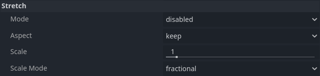
Stretch Scale
The Scale setting allows you to add an extra scaling factor on top of
what the Stretch options above already provide. The default value of 1.0
means that no additional scaling occurs.
For example, if you set Scale to 2.0 and leave Stretch Mode on
Disabled, each unit in your scene will correspond to 2×2 pixels on the
screen. This is a good way to provide scaling options for non-game applications.
If Stretch Mode is set to canvas_items, 2D elements will be scaled relative to the base window size, then multiplied by the Scale setting. This can be exposed to players to allow them to adjust the automatically determined scale to their liking, for better accessibility.
If Stretch Mode is set to viewport, the viewport's resolution is divided by Scale. This makes pixels look larger and reduces rendering resolution (with a given window size), which can improve performance.
To configure the stretch scale at runtime from a script, use the
get_tree().root.content_scale_factor property (see
Window.content_scale_factor).
You can also adjust the scale at which the default project theme is generated using the GUI > Theme > Default Theme Scale project setting. This can be used to create more logically-sized UIs at base resolutions that are significantly higher or lower than the default. However, this project setting cannot be changed at runtime, as its value is only read once when the project starts.
Stretch Scale Mode
Since Godot 4.2, the Stretch Scale Mode setting allows you to constrain the
automatically determined scale factor (as well as the manually specified
Stretch Scale setting) to integer values. By default, this setting is set to
fractional, which allows any scale factor to be applied (including fractional
values such as 2.5). When set to integer, the value is rounded down to
the nearest integer. For example, instead of using a scale factor of 2.5, it
would be rounded down to 2.0. This is useful to prevent distortion when
displaying pixel art.
Compare this pixel art which is displayed with the viewport stretch mode,
with the stretch scale mode set to fractional:
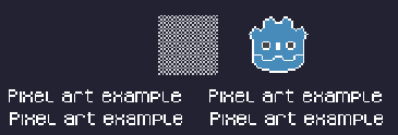
Checkerboard doesn't look "even". Line widths in the logo and text varies wildly.
This pixel art is also displayed with the viewport stretch mode, but the
stretch scale mode is set to integer this time:
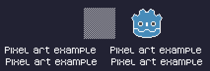
Checkerboard looks perfectly even. Line widths are consistent.
For example, if your viewport base size is 640×360 and the window size is 1366×768:
When using
fractional, the viewport is displayed at a resolution of 1366×768 (scale factor is roughly 2.133×). The entire window space is used. Each pixel in the viewport corresponds to 2.133×2.133 pixels in the displayed area. However, since displays can only display "whole" pixels, this will lead to uneven pixel scaling which results in incorrect appearance of pixel art.When using
integer, the viewport is displayed at a resolution of 1280×720 (scale factor is 2×). The remaining space is filled with black bars on all four sides, so that each pixel in the viewport corresponds to 2×2 pixels in the displayed area.
This setting is effective with any stretch mode. However, when using the
disabled stretch mode, it will only affect the Stretch Scale setting by
rounding it down to the nearest integer value. This can be used for 3D games
that have a pixel art UI, so that the visible area in the 3D viewport doesn't
reduce in size (which occurs when using canvas_items or viewport stretch
mode with the integer scale mode).
Truco
Games should use the Exclusive Fullscreen window mode, as opposed to Fullscreen which is designed to prevent Windows from automatically treating the window as if it was exclusive fullscreen.
Fullscreen is meant to be used by GUI applications that want to use per-pixel transparency without a risk of having it disabled by the OS. It achieves this by leaving a 1-pixel line at the bottom of the screen. By contrast, Exclusive Fullscreen uses the actual screen size and allows Windows to reduce jitter and input lag for fullscreen games.
When using integer scaling, this is particularly important as the 1-pixel height reduction from the Fullscreen mode can cause integer scaling to use a smaller scale factor than expected.
Escenarios de casos de uso comunes
Se recomiendan las siguientes configuraciones para admitir múltiples resoluciones y relaciones de aspecto.
Juego de escritorio
Non-pixel-art:
Set the base window width to
1920and window height to1080. If you have a display smaller than 1920×1080, set Window Width Override and Window Height Override to lower values to make the window smaller when the project starts.Alternatively, if you're targeting high-end devices primarily, set the base window width to
3840and window height to2160. This allows you to provide higher resolution 2D assets, resulting in crisper visuals at the cost of higher memory usage and file sizes. You'll also want to increase GUI > Theme > Default Theme Scale to a value between2.0and3.0to ensure UI elements remain readable.Note that this will make non-mipmapped textures grainy on low resolution devices, so make sure to follow the instructions described in Reducir el alias en la reducción de la muestra.
Set the stretch mode to
canvas_items.Establece el aspecto de estiramiento (stretch aspect) en
expand. Esto permite admitir múltiples relaciones de aspecto y aprovecha mejor las pantallas de teléfonos inteligentes alargadas (como las relaciones de aspecto 18:9 o 19:9).Configura los anclajes de los nodos de tipo Control para que se ajusten a las esquinas correctas utilizando el menú Layout (Diseño).
For 3D games, consider exposing Resolution scaling in the game's options menu to allow players to adjust the 3D rendering resolution separately from UI elements. This is useful for performance tuning, especially on lower-end hardware.
Pixel-art:
Set the base window size to the viewport size you intend to use. Most pixel art games use viewport sizes between 256×224 and 640×480. 640×360 is a good baseline, as it scales to 1280×720, 1920×1080, 2560×1440, and 3840×2160 without any black bars when using integer scaling. Higher viewport sizes will require using higher resolution artwork, unless you intend to show more of the game world at a given time.
Ajusta el modo de estiramiento en
viewport.Establece el aspecto de estiramiento (stretch aspect) en
keeppara mantener una sola relación de aspecto (con barras negras). Como alternativa, puedes establecer el aspecto de estiramiento enexpandpara admitir múltiples relaciones de aspecto.Si estás utilizando el aspecto de estiramiento
expand, configura los anclajes de los nodos de tipo Control para que se ajusten a las esquinas correctas utilizando el menú Layout.Set the stretch scale mode to
integer. This prevents uneven pixel scaling from occurring, which makes pixel art not display as intended.
Nota
The viewport stretch mode provides low-resolution rendering that is then
stretched to the final window size. If you are OK with sprites being able to
move or rotate in "sub-pixel" positions or wish to have a high resolution 3D
viewport, you should use the canvas_items stretch mode instead of the viewport
stretch mode.
Juego móvil en modo horizontal
Por defecto, Godot está configurado para utilizar el modo horizontal (landscape). Esto significa que no necesitas cambiar la configuración de orientación de pantalla del proyecto.
Establece el ancho de ventana base en
1280y la altura de ventana en720.Alternatively, if you're targeting high-end devices primarily, set the base window width to
1920and window height to1080. This allows you to provide higher resolution 2D assets, resulting in crisper visuals at the cost of higher memory usage and file sizes. Many devices have even higher resolution displays (1440p), but the difference with 1080p is barely visible given the small size of smartphone displays. You'll also want to increase GUI > Theme > Default Theme Scale to a value between1.5and2.0to ensure UI elements remain readable.Note that this will make non-mipmapped textures grainy on low resolution devices, so make sure to follow the instructions described in Reducir el alias en la reducción de la muestra.
Set the stretch mode to
canvas_items.Establece el aspecto de estiramiento (stretch aspect) en
expand. Esto permite admitir múltiples relaciones de aspecto y aprovecha mejor las pantallas de teléfonos inteligentes alargadas (como las relaciones de aspecto 18:9 o 19:9).Configura los anclajes de los nodos de tipo Control para que se ajusten a las esquinas correctas utilizando el menú Layout (Diseño).
Truco
To better support tablets and foldable phones (which frequently feature
displays with aspect ratios close to 4:3), consider using a base resolution
that has a 4:3 aspect ratio while following the rest of the instructions
here. For instance, you can set the base window width to 1280 and the
base window height to 960.
Juego móvil en modo vertical
Set the base window width to
720and window height to1280.Alternatively, if you're targeting high-end devices primarily, set the base window width to
1080and window height to1920. This allows you to provide higher resolution 2D assets, resulting in crisper visuals at the cost of higher memory usage and file sizes. Many devices have even higher resolution displays (1440p), but the difference with 1080p is barely visible given the small size of smartphone displays. You'll also want to increase GUI > Theme > Default Theme Scale to a value between1.5and2.0to ensure UI elements remain readable.Note that this will make non-mipmapped textures grainy on low resolution devices, so make sure to follow the instructions described in Reducir el alias en la reducción de la muestra.
Establece Display > Window > Handheld > Orientation en
portrait(vertical).Set the stretch mode to
canvas_items.Establece el aspecto de estiramiento (stretch aspect) en
expand. Esto permite admitir múltiples relaciones de aspecto y aprovecha mejor las pantallas de teléfonos inteligentes alargadas (como las relaciones de aspecto 18:9 o 19:9).Configura los anclajes de los nodos de tipo Control para que se ajusten a las esquinas correctas utilizando el menú Layout (Diseño).
Truco
To better support tablets and foldable phones (which frequently feature
displays with aspect ratios close to 4:3), consider using a base resolution
that has a 3:4 aspect ratio while following the rest of the instructions
here. For instance, you can set the base window width to 960 and the
base window height to 1280.
Aplicación no jugable
Establece el ancho y la altura de la ventana base al tamaño más pequeño de ventana que tienes la intención de dirigir. Esto no es obligatorio, pero garantiza que diseñes tu interfaz de usuario teniendo en cuenta tamaños pequeños de ventana.
Mantén el modo de estiramiento en su valor predeterminado, que es
disabled(deshabilitado).Mantén el aspecto de estiramiento en su valor predeterminado, que es
ignore(su valor no será utilizado ya que el modo de estiramiento está endisabled).You can define a minimum window size by calling
get_window().set_min_size()in a script's_ready()function. This prevents the user from resizing the application below a certain size, which could break the UI layout.Add a setting in the application's settings to change the root viewport's stretch scale, so that the UI can be made larger to account for hiDPI displays. See also the section on hiDPI support below.
Soporte hiDPI
By default, Godot projects are considered DPI-aware by the operating system. This is controlled by the Display > Window > DPI > Allow hiDPI project setting, which should be left enabled whenever possible. Disabling DPI awareness can break fullscreen behavior on Windows.
Since Godot projects are DPI-aware, they may appear at a very small window size
when launching on an hiDPI display (proportionally to the screen resolution).
For a game, the most common way to work around this issue is to make them
fullscreen by default. Alternatively, you could set the window size in an
autoload's _ready() function according to
the screen size.
To ensure 2D elements don't appear too small on hiDPI displays:
For games, use the
canvas_itemsorviewportstretch modes so that 2D elements are automatically resized according to the current window size.For non-game applications, use the
disabledstretch mode and set the stretch scale to a value corresponding to the display scale factor in an autoload's_ready()function. The display scale factor is set in the operating system's settings and can be queried using screen_get_scale. This method is currently implemented on Android, iOS, Linux (Wayland only), macOS and Web. On other platforms, you'll have to implement a method to guess the display scale factor based on the screen resolution (with a setting to let the user override this if needed). This is the approach currently used by the Godot editor.
The Allow hiDPI setting is only effective on Windows and macOS. It's ignored on all other platforms.
Nota
The Godot editor itself is always marked as DPI-aware. Running the project from the editor will only be DPI-aware if Allow hiDPI is enabled in the Project Settings.
Reducir el alias en la reducción de la muestra
Si el juego tiene una resolución de base muy alta (por ejemplo, 3840×2160), podría aparecer el "aliasing" al reducir la muestra a algo considerablemente más bajo como 1280×720.
To resolve this, you can enable mipmaps on all your 2D textures. However, enabling mipmaps will increase memory usage which can be an issue on low-end mobile devices.
Trabajando con relaciones de aspecto
Una vez que se tiene en cuenta el escalado para diferentes resoluciones, asegúrate de que tu interfaz de usuario también escala para diferentes relaciones de aspecto. Esto puede hacerse usando anchors y/o containers.
Escalado del campo de visión
La propiedad Keep Aspect del nodo de la Cámara 3D se ajusta por defecto al modo de escala Keep Height (también llamado Hor+). Este suele ser el mejor valor para los juegos de escritorio y los juegos para móviles en modo apaisado, ya que las pantallas panorámicas utilizarán automáticamente un campo de visión más amplio.
Sin embargo, si tu juego 3D está pensado para ser jugado en modo retrato, puede tener más sentido usar Mantener el ancho en su lugar (también llamado Vert-). De esta manera, los smartphones con una relación de aspecto superior a 16:9 (por ejemplo, 19:9) usarán un campo de visión más alto, lo cual es más lógico aquí.
Scaling 2D and 3D elements differently
To render 3D at a different resolution from 2D elements (such as the UI), use Godot's resolution scaling functionality. This allows you to control the resolution scale factor used for 3D without needing to use a separate Viewport node. This can either be used to improve performance by rendering 3D at a lower resolution, or improve quality via supersampling.